If you’re building, buying, or managing software products right now, there are major implications for that trend.
But I have good news for you.
This isn’t a post about whether AI is overhyped, nor is it a doomer take about jobs disappearing overnight.
Instead, I’m mapping out where I believe the economics of SaaS are actually heading over the next five years, and what it means for the companies being built, the teams building them, and what you should do about it starting today.
Have you written one of those “It’s Time to Embrace AI” memos to your team like we’ve seen go viral from Shopify, Duolingo, or Box?
How has that gone for you?
Best laid plans…
While everyone knows they should be using AI, changing behaviors is hard.
And learning a new skill and technology that’s unlike past generations of tools is even harder.
Yet, too often, founders and executives think they can just order their team to do it, and magically everyone will embrace AI and get all the benefits we hear hyped online.
I recently worked with a client helping them improve their AI adoption. There I saw even smart, capable people weren’t using AI very often beyond some basic questions to ChatGPT. I learned the real problem isn’t awareness nor desire; the reality is it comes down to problems like time, uncertainty, and trust.
Today’s post breaks down what worked (and what didn’t) in helping a team move from curiosity to consistent AI use, and gives you practical approaches to apply to changing the AI culture at your team, whether you need to get everyone, or a slow adopter or two, on board.
If you’ve ever submitted product feedback through a customer support widget like Intercom or Zendesk, you know how much of a lost, black hole it can feel like.
Yet, for many companies, that’s exactly where product feedback goes, never to be seen or heard from again.
It’s not Customer Success’s fault.
Customer support and success have important jobs. They’re helping fix problems, educate customers, clear up confusion, and catch bugs.
But triaging problems and being patient with frustrated customers is a totally different skill set than understanding customer needs and making product decisions.
It’s no surprise then that the feedback CS does receive often gets lost in the shuffle, dumped in a backlog somewhere, or filed away, never to be seen again.
What else are they supposed to do?
Let’s take a closer look at these misaligned incentives and responsibilities, and why they leave customers feeling unheard and product teams missing out on priceless customer feedback and connections.
“If you love what you’re doing and you always put the customer first, success will be yours.” – Ray Kroc, co-founder of McDonalds
“The more you engage with customers, the clearer things become and the easier it is to determine what you should be doing.” — John Russell, Harley Davidson
“Make something people want.” – YC
There are a lot of catchy sayings and aphorisms about listening to your customers.
And they’re right. It is *really* important to listen to them.
Yet, in practice, there are a lot of reasons that doesn’t happen. Or at least not as well as you would ideally like to.
And the cost is high. Building what internal stakeholders, “visionary” founders, or selfish PMs want instead of what the market is signaling wastes time, capital, and precious opportunity.
In a world where AI is helping us all move much faster, and the cost of building is rapidly falling, building the right thing has never been more important; you’ll either get it right, or someone else in the market will.
Based on conversations with PMs I’ve coached, those I’ve recently interviewed for my new startup, and speaking with friends, here’s the common blockers (and sometimes excuses) for why the voice of the customer isn’t heard as clearly as it should at companies of all sizes.
Do you find your product team doesn’t want to read your specs? Do others find them a lot less clear than you think they are?
Are you and your engineers missing estimates, or struggling to ship on time, because of changing requirements and surprise details changing context mid-build?
If you’re having trouble with things like missed deadlines, confusion and miscommunication mid-project, and not shipping your best possible work consistently, then it might be time to take a hard look at your product specs. They’re likely a big part of the problem.
The Product Thesis: A Better Way
Early in my career I was kind of winging it when it came to planning with my engineering and design teams. I had all kinds of documents all over, and I was inconsistent in the process from sprint to sprint and project to project.
Not surprisingly, it showed in the results we got, and the problems we had.
Fortunately, when I joined KISSmetrics, Hiten helped me learn a better way by introducing me to Josh Elman, who worked on product teams at Twitter, Facebook, and Linkedin. Josh taught me about the Thesis, which is a lightweight, efficient way to communicate all the essential details your product team needs.
It led to engineers and designers actually reading what I wrote in my specs, better ideas coming from everyone, and ultimately shipping more wins faster. It really was that transformative.
Now that I’ve used the Thesis on dozens of projects of my own, taught it to many of my clients, and tweaked it based on what I found worked best across many situations, I’m going to teach you how to write your own thesis for the next feature or product you build.
The Better Product Spec Alternative: How to Write a Product Thesis
By using Josh’s Product Thesis, I solved a lot of the problems I had, and similar ones I see with my coaching clients:
Hard to find everything: Too many docs in too many places means key info can’t be found or is missed. The Thesis represents one place for all the most important answers for you, designers, engineering, and other stakeholders.
Too long, didn’t read: Most people do not read 10+ page documents. The Thesis and its bullet driven structure forces you to get right to the point. My average thesis (excluding further reading) is only 2-3 pages, which led to everyone reading them.
Missing key info: Compare the list of areas below to the product spec for your recent work. In my experience, most PM’s specs are missing roughly half of them, which is a missed opportunity for better, clearer planning and organization.
Being Solution, not Problem-oriented: Too many specs I review are dictating outcomes all the way down to button placements. The best solutions come from discussion and debate with your engineers and designer. A thesis becomes a primer for solution discussions to ensure the most important & impactful opportunities are tackled.
When you pull all this information together in one, brief, easy to read place, it helps your product team better understand the why behind a feature and come up with the best solutions together. It helps motivate them more as well, because it helps them really taste and feel customer pain and opportunities.
When should I use a Product Thesis?
There are two simple things to keep in mind to determine if you need to pull everything listed below together for a Product Thesis:
1) For all significant projects
If a project or task will take less than a week’s time or fits in the “Quick Win” category of a simple ticket or two in your project management tool, then you do *not* need to make a Product Thesis.
Meanwhile, if you know for a project there will be:
An Epic in your project management tool to tie a bunch of tickets together
Enough design changes you know you’ll do some major user testing
Any major changes to workflows or processes
The project is a key part of your OKR/Quarterly roadmap
Then, those are exactly the times where pulling all of the things you’ve learned about the project and opportunity into a Thesis is the right move.
2) Before you start thinking or talking about solutions
It’s sooo tempting to start thinking about what you could do for customers. Yet, you shouldn’t do that. Pull back.
Instead, you need to pull all the information about the problem together for you and your team in your Product Thesis so that you have the guardrails for a deep discussion with your designer and engineers about:
What’s possible to do?
If we could wave a magic wand, what would we create for our customers?
What can we get done within the time constraints and budget we have?
What quick wins could fit in related to this?
What should be de-scoped because it’s too hard?
Design and tech debt considerations that come into play.
You only get the magical alchemy of building incredible products when you include your design and engineering team in the solution process. It’s what both Steve Jobs and Marty Cagan do.
And they and you can only combine to come up with the best solutions when you set the table with all the information everyone needs to truly understand the problems, opportunities, and constraints. It also engages and motivates them much better than dictating solutions to them.
Knowing all of this, let’s dive into what actually goes into a Product Thesis.
Want a FREE Product Thesis Template to use on your next project?
Sign up now and I’ll send you the template I’ve used for 10+ years:
What goes into the Product Thesis?
Below are the sections with explanations for why they’re each important. If you have any questions about any of them, please leave a comment on this post. You can also listen to this podcast discussion on the Thesis I did years ago as well if you like audio.
Remember: Stick to bullets! This should ideally be 1-3 pages long as that ensures that your team really reads it and can engage quickly. You can write up a separate memo like the Amazon Press Release style for marketing and other stakeholders after you and your product team have settled on the solution & scope.
The goal here is to clarify your thinking, make sure you didn’t miss anything, and set the stage for a great discussion with your engineering and design partners on what is possible within the constraints and opportunities you outline.
To this day, 15+ years in my career and over 10 years since that fateful meeting with Josh Elman, I still start every Product Thesis I write by copying a template like the one you can sign up for on this post.
Okay, here’s the sections of the Product Thesis and why they matter:
Product Thesis Title Here
1) Why are we working on this next?
This is first for a reason: This is what gets others excited and bought into what you’re building.
Every company, and especially startups, are resource constrained. What you choose to build affects your company’s bottom line, your standing in the market, and what your team thinks of your judgment.
You need to succinctly get everyone reading this on board to why this is the biggest problem or best opportunity.
I try to have a mix of qualitative and quantitative data here including:
Mandates from the leadership team to focus on this area
How sales needed it for a big customer, or how many customers are begging for it
A stark number that paints the clear picture and creates urgency (like an alarming churn rate, big dollar value deals the feature is for, or clear weak points in a key funnel)
The more your designers and engineers can understand why this matters, the more interested they will be in working on it, even when it’s not the hottest new tech or feature.
2) When and how do people use this feature?
Most products end up having a variety of different users and ways that people use the product. To help your team better design a specific feature for the right part of your customer base, you need to detail who this new feature is for.
Be specific! A use case section that is just something like, “As a marketer, I want a mobile app so I can access my data away from a computer” is total weaksauce. Instead, provide the kind of context and detail that paints a picture of the situation:
“On their way to work on the subway, content marketers like to check how their blog traffic is doing for items they published that morning or the day before. It helps them get into work and know how they’re doing before they sit down. If a number is low, they may try promoting it extra to try to raise the number. If the number is high, they may share the win with others on the team.”
Could you picture that situation in your mind? Can you see Jenn the marketer opening an app on her iPhone while sitting on a subway car? I bet you could. Your team can, too. They can also then start thinking about what the perfect (not just good) solution would be for them.
Write out as many use cases as you feel are needed. I often have as many as 4 or 5 detailed cases for a big feature, especially when our product has multiple personas.
3) What Problems do we need to solve? (in order of priority)
Features are really solutions to your customer’s problems. It doesn’t do any good to build a feature that doesn’t actually solve the problem, so it’s important to detail what problems you need to ensure the solution your team creates addresses them.
Problems should either be existing problems your product has (especially if you’re iterating on an existing feature) or the problems related to the use cases you just described above. Some example problems may be:
Performance Problem: Customers are experiencing frequent crashes (57 incidents last week). This feature is critical for customers and they are constantly having to refresh and start over, losing their work in the process.
Design Problem: 20% of support tickets are due to customers are having issues with the current UI. They can’t find key features that exist that they say are important to them (Include a markup of the interface to show these.)
New Problem:Customers spend hours every week manually copying numbers to a spreadsheet and making their own visuals for their VP. If we automatically make those reports, we’ll save them time and can then have the VP see our branded reports frequently.
I usually write out 5-7 problems that a feature addresses in bullet form. If it only applies to some of the use cases I described, I’ll specify that as well.
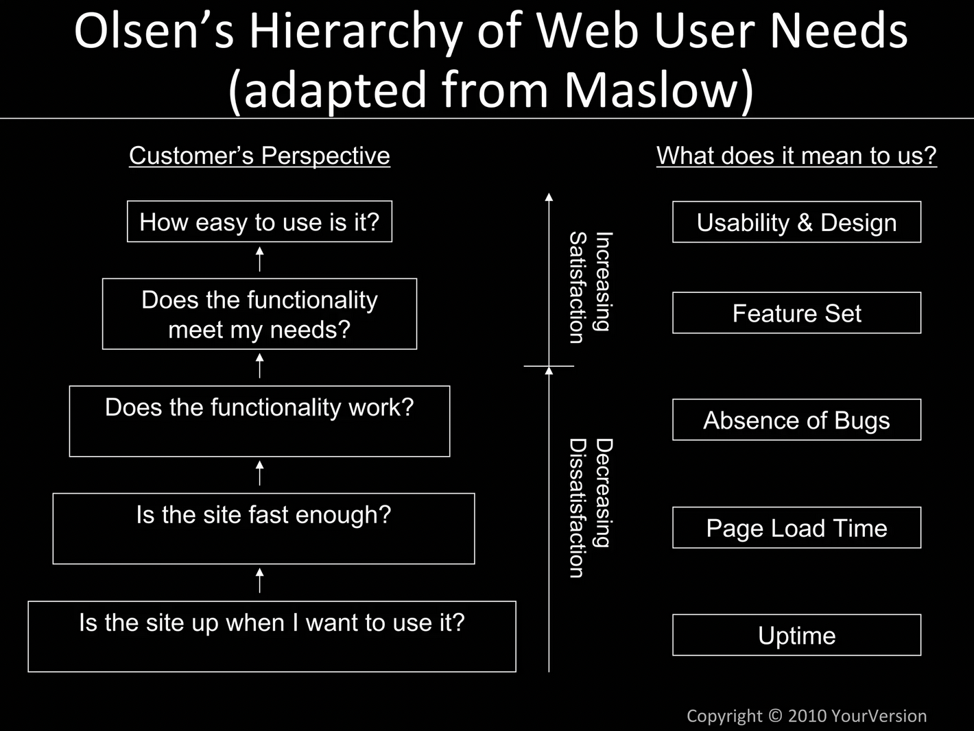
Remember to also rank the problems, so that the most important issues get the most attention. When ranking, remember Olsen’s Hierarchy of Needs as a helpful framework on what matters most: (Note – the bottom is most important like Maslow’s Hierarchy)
This ranking matters most when it’s time for tradeoffs. A detailed ranking of problems will help you make sure the right things get done and avoid being de-scoped, while less important, and difficult items quickly hit the chopping block.
4) How much time is budgeted for this project? When do we need to be completed with this by?
One of the additions that I’ve found has been important for most product teams, but wasn’t in Josh’s original lesson for me was to call out the time / budget for a given project.
This is important to think about for 3 reasons:
Your engineering and design teams need to know how big a project this can be, so you can talk tradeoffs and scope effectively with them as you collaborate on coming up with the best solution for this phase of the project.
You are consciously choosing how long you work on this project versus the other potential projects and goals you have. You have finite time and resources, so you need to decide what is worth the largest investment. RICE and similar frameworks can help with this, as well as thinking about these kinds of tradeoffs:
Your stakeholders need to know when you’ll deliver this project, so they can plan accordingly for how they’ll act based on this launch.
In particular, sales and marketing teams can become very frustrated by majorly missed deadlines. It not only impacts their planning, but it critically affects their ability to hit their numbers.
The simplest way to avoid these kinds of issues is to start making the time allotted for a project something that is defined at the earliest stages of planning. That’s why in this section the goal is to very succinctly, in 1 sentence in 1 bullet define:
How many weeks you have for this project and a target ship date (or time when it’s in QA and ready for your deploy process.)
Yes, you may want some flexibility depending on what you decide is important, and that’s exactly the point; time spent on this project should be an active part of the discussion. Otherwise, I’ve seen too many cases of projects that run much longer than planned, or scopes that get completely out of control, preventing essential other projects from happening.
5) What are Future Considerations that must be accounted for?
This section is all about avoiding hearing from engineering, “I wish you had told me that before we built [X]!”
Very often, when engineers build something, there’s a few ways they could do it. When you give them a hint of what may come in the future, or that was de-scoped early in this process, they can make more intelligent decisions about how they build things now. A small change now can make a revisit to the feature *much* easier 6 months later.
Depending on the feature, this could be very short or long section. If there are things you know are not going to make the first version of this feature, but expect will be needed to be added later, be sure you tell your team!
You can also use this section to note things that originally were planned for, but after discussing with your team, you de-scoped. This is how you turn your Product Thesis into a living document that is useful to reference at many points in your product development process.
The bottom line: Balancing the present and the future is a constant struggle for your product. The best thing you can do for your team is give them the key information you know so they can do their best to balance their work against the present and future as well.
6) (Optional) How does this tie back to this quarter’s OKR(s)?
This should be a single sentence explaining which of your OKRs this project relates to, why it does, and a link back to your OKRs document or tool.
The point of this is to make it obvious to anyone seeing your Product Thesis how you see this contributing to your OKR(s).
If you don’t have OKRs, obviously ignore this section. You can also include this in your Why section in the intro if you prefer, but I’ve found that explicitly calling it out like this is helpful for others (like say an executive or your boss). As with everything in the Thesis, use your best judgment for what fits your team and company.
7) What is our KPI or Metric for this Thesis?
This is one of biggest gaps in most product specs I’ve reviewed, and it’s critical that every Thesis have some form of this.
You should ask yourself, “What would make this new feature a success?” A KPI (Key Performance Indicator) is the most common way to determine that success since ideally you will tie the success of the feature to one or more of your company’s key metrics.
It’s okay to have more than one KPI, but keep it simple, or there will be too many things to measure. When I’ve had multiple KPIs for a feature they’ve been things like:
Support requests will drop by 90% for this feature after relaunch.
Usage of our app’s [X] feature will grow by at least 50% after relaunch.
Because this feature affects the sign up flow, we expect a 5% lift in conversion after this launches.
You will fail sometimes, but by forcing yourself to quantify what you expect to happen, you will keep you and your team honest. By setting a number that you must hit, you can also know when you should go back and iterate further. You’ll also hone your instincts on what creates wins and what does not.
Further, by identifying the metric up front, you make sure any tracking that needs added to the product is done while your engineers build it, saving them time going back later, or lacking a baseline after launch.
Most important for this section is simply the act of committing to measurement. Shipping is not success as a product manager, but without calling out measurement in your spec, I find most PMs never get around to measuring a lot of what they should for their features.
8) Who are the stakeholders and how/when do they need to be informed?
When work gets busy, it’s easy to forget about stakeholders and other people you don’t work with every day. That’s how you end up forgetting to loop someone in when they need to be.
This can end up hurting you and your company in a variety of ways:
Your launch may flop, because marketing had no time to prepare a press push or launch announcement.
Sales misses out on some deals, because they don’t know what is available soon enough to close a key, tightly fought deal.
Other teams may step on your toes, because they didn’t know what you were working on.
Avoid shooting yourself in the foot by thinking through who you need to involve in this project and how. Keep it simple, much like the OKR section, by simply:
Listing out the Name, Department, and when and how you expect them to be involved in the project. One name per bullet.
Then, make sure you stick to that plan, and confirm with the stakeholder you agree on how they’ll be involved and what they need to know.
This is a checklist to remind you who to speak with and helps you make sure you give them all the time and information they need to coordinate with you effectively.
9) Further Reading:
Your main document shouldn’t be longer than 2-3 pages, so Further Reading can act as an Appendix for you. This section allows readers to easily jump into an area that is most interesting to them and see the data or evidence that backs up your Thesis bullets.
Add links to customer research, call recordings, feedback, quotes, usability testing, surveys, survey analysis, specific analytics reports or queries, etc. While your main document should be no more than 3 pages, Further Reading can be as long as you want.
Remember: You want all the detail you can without the fluff and verbosity that makes engineers and designers skip reading it. Further reading is a great place for specific information that didn’t fit in the above sections and may be relevant to only certain team members.
Who should I share this with and when? How do I use this with Stakeholders?
The number one goal of this document is to help you bring clarity of thought and a clear definition of the project to set up a healthy discussion with your design and engineering team. Together, you’ll work out what the best solution is based on the constraints, problems, and opportunities here.
The secondary goals of this document and process is to:
Help you identify weaknesses in the work you’ve done to define this (i.e.- Don’t know something? Go find out.)
Start thinking ahead for how to involve marketing and other stakeholders at the right times.
Give you an organized place where you have all your research and thoughts in one place, so you can share all or part of it when it’s helpful in stakeholder discussions.
This then makes it easier to share with other colleagues when it makes sense. Once things are solidified with your core product team, it often can be helpful to share your Thesis with some of the stakeholders you noted in section 8; the same use cases and problems that inspire your designer can also inspire marketing copy or sales pitches.
Conclusion: A great Product Thesis is a high leverage asset for PMs
Creating a great product spec clarifies your thinking, organizes it clearly for others, and helps you avoid many of the most common pitfalls of the product development process.
The best way to ensure your product specs are consistently high quality is to use a template to guide you. That way, you don’t forget anything, and others get used to a consistent format from you.
If you’d like to upgrade your product specs, and want to start using the Product Thesis, I have created a template you can use now. Simply enter your email below to receive the template straight to your inbox:
I’ve been working on SaaS products for nearly 15 years, which feels kind of crazy to write. While I’ve worked on a lot of very cool products and helped many other PMs over the years, it doesn’t seem like it’s been that long.
What lessons have I learned?
The other day, a friend asked me what rules I’ve learned that I would apply from day 1 the next time I start a company. It got me thinking, and once I jotted my thoughts down, I realized it was worth sharing as a post here.
There is no need for a lengthy preamble, so let’s get right to them.
10 Lessons for Scaling Your SaaS Startup Faster
Consider this a checklist of simple tactics and approaches that I’ve seen first hand work repeatedly. Maybe your situation is different, but they’re all worth at least experimenting with, and very likely moving up your priority list to do sooner.
Many of these I learned the long and hard way, and wish I had done sooner, which is a big part of why I decided to write and share this post. It’s the kinds of things I coach my clients to think about regularly, so this is also a reference for them in the future, too.
I hope you learn a thing or two, and make a few extra dollars faster because of them.
1) Start charging as soon as you can. Earlier than you think you can.
One of the greatest mistakes I see founders make is to wait to charge money for their startup. It crushes me to see friends and mentees waste months, or in some cases even years, of their lives building their product for free, avoiding the hard question of, “Will anyone pay for this?”
The fact is people will use a lot of things when they’re free that they’d never pay for. And equally important, you don’t learn many key things when you put off the discussion about them paying:
What is their buying process?
What kind of budget do they have for this sort of problem?
Is this problem important enough that they’ll pay for it?
Can your user even make buying decisions?
Will they pay enough for this product to make your business viable?
In one particularly sad case, a friend of mine went years without charging for his product. In the process of chasing the mythical startup where he’d charge based on progress next month, he not only ultimately had to shut down the startup, but he destroyed his personal credit, his wife divorced him, and he lost custody of his daughter. I wish I was exaggerating any of that.
Don’t be a cautionary tale. Cross the penny gap as soon as you can.
I’m still amazed that I got customers to start paying for my startup, Lighthouse, when we were a barely functional CRUD app. You could post some notes, and we sent a morning reminder email, and that was it. Yet, people not only paid, but my second customer ever actually prepaid annually. Quite the vote of confidence.
The Bottom Line: Start charging customers before you think you can. Often, you can even get them to pay *before* you build anything. But you won’t know unless you ask.
2) Offer annual subscriptions from day 1.
Now that you know you should start charging as soon as you can, and earlier than you think, the next move is to have an annual plan.
You may be surprised to realize that many people prefer annual agreements; it’s standard for procurement departments, and if you need reimbursement or approval to spend money, you only want to go through the hassles once a year.
And that’s before you get into basic persuasion.
The single most profitable, highest impact experiment we ever did in the history of Lighthouse was an email we sent to customers.
After 3 months of them paying monthly, we sent an email that essentially said, “Looks like you’ve been enjoying using Lighthouse. Why don’t you save yourself some money and buy an annual plan?” Our annual plan gave them 2 free months, and that’s all they needed to think it was a no-brainer to pay annually.
Some founders I’ve met are afraid to offer annual plans up front, and to some extent, I thought people wouldn’t want to. But the fact is, if you offer it, some will say yes, and if they say no, you’ll learn helpful things anyways.
The Bottom Line:Offering an annual plan can help you grow your revenue much faster. Especially if you’re bootstrapping, this can provide critical rocket fuel to fund and grow your business, all while lowering your churn rate (they can’t cancel for 12 months, after all).
Apple makes a little bit of money from services. Can you? (SOURCE)
3) Charge for services you provide. People will pay.
You’ll notice the first two tips are all about helping you make money faster. This third one is also about money, too.
The fact is, you need revenue to grow your business. It’s the oxygen to keep your business going. (Obviously.)
Investor capital only goes so far, and getting that next round of funding is usually related to how much revenue you were able to generate with the last round of funding.
And if you’re bootstrapped, more revenue lets you quit your job sooner, or fund more growth faster.
Either way, more revenue sooner is a net good thing.
Yet, some people frown upon services revenue. They think charging one time costs for things like setup, training, manual work, custom integrations, etc is a bad thing because it’s not recurring revenue.
However, if you look at lot of successful publicly traded SaaS companies, services revenue is a real part of their total revenue each year. No, you don’t want it to be 90% of your revenue, nor do you want to become a custom development shop for anyone, but you can easily make 10-20% of the value of your contracts include one time services revenue. This is on top of whatever your annual subscription rate is.
This is awesome for you for a few reasons:
It’s free money on top of what you expected to make: You probably have to do the things you’ll charge them services revenue for anyways. Now, you’re making money for doing it. If it’s a $10,000 or greater deal, they probably expect it, so why not ask for it?
It’s a second negotiating point & an easy place to discount: Procurement is usually rewarded for saving money on the total contract, not necessarily an individual point. That means when they negotiate, you can discount the one-time, services revenue, while preserving the price of your recurring subscription. You can also use tactics like telling them you’ll waive it if they close today.
Renewal time is easier: While in year 2 you may have less services to charge for (or none at all depending on what you provided in year 1), you’re hopefully growing your subscription fees. With the services price down in your contract, you can often then grow your MRR in year 2 without substantially increasing the total cost to your customer. This is win-win as their books look better, and you show growth on your side.
The Bottom Line:Services revenue is your friend. It’s free money for any deal you’re negotiating of reasonable size, and you can ask for it as soon as you start charging customers.
4) Use software to make yourself more efficient.
One of the great breakthroughs of the last decade is how software has been eating the world; there’s now software to help you do just about everything. This saves you time, money, and allows you to do more with a smaller team than was ever possible before.
It’s amazing to me how much my team and I have been able to do never being more than a team of 7, thanks to the fact that virtually every department has software to help support it.
A few of my favorites include:
Intercom: Covers all of our help docs, customer support tickets, in app messaging, product tours, and chat on our marketing site.
Gusto: Simple payroll so I never have to think about paying employees or contractors, nor worry about tax time.
Upwork: For easily finding high quality, inexpensive workers in other countries. Takes care of paying them, monitoring their work, and helping you run an efficient hiring process each time.
Digital Ocean: So easy to use that as a non-technical CEO, I can go in and make upgrades and check or fix things in a bind.
Strikingly: Simple landing page tool, which has allowed us to build landing pages that look great even with no designers or engineering involved.
Stripe: The easiest payment processing setup I’ve seen, that makes it easy to manage your subscriptions, handle refunds, and use across multiple offerings you have.
And I could list out dozens more, all of which combine to save us time and money.
Over the years, I’ve embraced this idea more and more, which has led to a few simple rules for adding software to our stack:
Anything that costs less than $50/month is a no brainer: Any team member can ask for the company to pay for a tool at that price or less. If it helps them do their job, it always pays for itself. All I ask is what it is, and an invite so I can enter the credit card.
With a strong case, most other tools still are purchased: Above $50, we have a quick discussion about it. The team member requesting it has to help us calculate the benefit, and as long as it generates more value than we pay for it, we’ll purchase it.
I’ve rarely regretted buying any software to help my team and I, and even when it doesn’t work out, it’s usually tool specific, not use case specific. That means we cancel one tool to switch to another, similar one that’s better/faster/cheaper.
And all of this was learned before AI came along. Now, I’m rethinking this further, as now I realize tools like ChatGPT and Claude.ai can automate and speed up things I never thought software could.
The Bottom Line: Software helps you and your team go faster. Don’t slow yourself down by making it hard to add helpful tools to your stack, or being penny wise and pound foolish.
5) Marketing has to be a part of your plan from the start.
At the peak of the bottoms up SaaS era (which I consider roughly 2010-2020), it was often thought that building a great product that can expand virally in a company was the most important thing you could do. Some even thought of freemium as a form of marketing en lieu of other strategies.
While some of those rules still apply, it’s become clear that marketing must be a part of your plan from the start. Building software has gotten easier and faster, and AI is rapidly bringing commoditization to many markets, so you cannot ignore distribution.
Build it and they will come was never a particularly great strategy, but now it’s fatal. I think at this stage, teams should think in the frame of “Technical Cofounder” and “Distribution Cofounder”, because frankly, distribution is the most important thing a founder can work on if not building the product.
The good news is, all that effort investing in marketing early on can help you in a variety of ways:
Sourcing customer interviews: I used this blog to source the 40 managers I interviewed before we started building Lighthouse. If you can write a blog post, create an ad + landing page, or otherwise get attention for a problem, you can funnel that towards interviews and customers.
Easier trial and sales: Even if you have a great network, and you’re building in an industry you know, you’ll run out of friendly people to try your product pretty quickly. If you’re spinning up marketing efforts from the start, you can grow a lot faster.
See faster what you’re up against: Much like you don’t know if you have something until you charge money for it, you don’t know what marketing will work until you try it. Finding out your costs of acquiring a lead are much higher or lower than you expected can help you understand the viability of your business much faster.
Lay a foundation sooner: Especially if you want to try SEO or social media as a key tactic, it can take some time for it to start to pay off. That means the sooner you start, the better.
While I started thinking about marketing from the start of my last startup, I will be even more aggressive next time. Instead of blogging on my personal blog for the first few months, I would have started the company blog from the day we bought our domain. Every bit helps and gets you to escape velocity in your marketing faster.
The Bottom Line: Don’t wait to figure out marketing. You need to be thinking about it from the start to be sure you really have a good business that you are well positioned to grow.
6) Choose your industry wisely, and learn all about it.
Spotting a problem or an opportunity to make things better is a great way to come up with startup ideas, but it’s not all it takes to be sure you’re onto something special.
It’s really important to think through the business you’ll be building and the industry you’d be working in. They all have their flaws, challenges, frustrations, and benefits. Make sure they’re things you’re well suited to tackle, and would enjoy tackling.
A few examples of pitfalls that I’ve seen stop founders in their tracks:
Two introverted engineers start a company that turns out to sell best at trade shows. It was not a good fit and exhausted them quickly.
A product minded founder built an easy to use product, but couldn’t find a way to reach his target market consistently, because they rarely were by a computer.
Two founders who loved helping their end user found they couldn’t stand dealing with the buyer for larger deals, who had different goals and incentives.
Founders looking to pivot their business thought they had a great idea for a different department, only to discover that department had no budget for what they could do.
The point isn’t that you need to find the perfect market; that doesn’t exist, because they all have their flaws and challenges. However, you can save yourself a lot of frustration and heartache if you do your homework up front to understand your market more clearly.
When evaluating an industry or market, be sure to find out:
Who is your end user?
Who is your buyer? How do they like to be marketed to and what is their purchasing process like?
What features are absolute deal-breakers for them, or the most important ones for their current solution?
What do the largest companies in your industry do best? What did they get really right?
I know it’s easy to think that your one insight will carry you to winning the market, but that’s typically only part of a bigger picture. Taking the time to get to know your industry can help you place much smarter bets early on, and make sure it’s a mission you want to be on for the next 5-10 years.
The Bottom Line: Do your homework thoroughly to really understand your industry. Read public company quarterly filings, interview people all through the value chain, and look at companies that have succeeded and failed in the market to truly learn.
7) Raise your Hierarchy of Value and avoid “nice to have”
Other than not charging money soon enough, the number one mistake I see founders make is starting a business that’s actually a “nice to have.” In fact, those two mistakes tend to go hand-in-hand.
There are a lot of things people will use for free that they will *never* pay for. Unfortunately, this is particularly true in the world of SaaS. But is it really SaaS if people don’t subscribe?
As I’ve seen many startups come and go, rise or fall, exit or shut down, it’s led to a theory on how to evaluate the value of a startup:
The point is, you have to think about the value you’re providing from the start of your company.
The clearer, and more important, the value you provide, the stronger your business is. If it’s only nice to have, or it’s a very vague time or money savings, then you’re likely to have a hard time (hence the grim reapers in the image).
However, all is no lost. Often you can raise your value over time, jumping or expanding from problem to another. In particular, I’ve seen this in HR tech, where a small tool grows into a full suite for performance management (most companies feel they need annual reviews), and then ultimately adding payroll (a legally obligated action) to rise all the way to the top of the hierarchy.
Of all the lessons I’ve learned in SaaS, this was one of the hardest for me to learn. It essentially comes down to these fundamental truths:
Just because you solve a problem for an end user, doesn’t mean a buyer cares.
If you don’t give the buyer what they need, it often won’t matter how much the end user likes what you do.
The bigger the buyer, the further distance they typically are from end users. They may not even speak with them at all.
Until you understand both the buyer and the end user, you don’t know what your business’s potential really is. Especially as the bottoms up SaaS era winds down, you can’t shortchange what buyers are thinking. When budgets are tight, markets consolidate, and IT re-asserts they role in decision making, you can’t count on front line users of your product to get the deal done for you.
Beware startup siren songs…
Who is your buyer? How far are they from the end user?
These are the two most important questions you need to ask when starting to evaluate a SaaS business.
That’s because the farther removed they are from your end user, the more likely you’re at risk of a Siren Song; in cases where there is a large gap between buyer and end user, the end user likely has a terrible experience and is not consulted at all in the buying process.
That’s a dangerous temptation for founders, who see the end user experience and then think that’s a great startup opportunity.
A great example of this is the performance management space. That’s because:
HR is the buyer
Managers and Employees are the end users
HR doesn’t consult with managers and employees when choosing their performance management software
Most performance management software is painful for employees to use, especially at large companies (just ask anyone who has ever used WorkDay or Ultimate Software…)
When I started Lighthouse, I was so singularly focused on the end user (managers, in our case) that I didn’t even think about the buyer. That lead to some painful and challenging lessons as I found our product was ill equipped for what the buyers (HR) really wanted.
And it’s not just about the features you have, or are missing. It’s also the structure of your organization, the buying process, and your positioning.
What resonates with your end user, and how you acquire them, can be totally different than what your buyer wants. If you’re not careful, you can have your entire company structured in a way that is counterproductive to your long term growth goals.
That’s why this is one of the most important lessons to keep in mind from the start.
The Bottom Line: Learn who your buyer is, why they buy, what their process is, and the features that matter to them as early as possible. You may be surprised to then realize that the incentives the buyer creates are why the end user experience looks like it’s so appealing to start a company to solve (but will ultimately limit your potential unless you satisfy the buyer, too).
9) Customer service is every startup’s greatest advantage.
Have you ever used enterprise software and sent in a support ticket? Often, it will take days to get a response, and at best you get a work around, but never an actual fix of the problem.
For many people, they deal with these kinds of problems and response on a daily basis.
That means that when they try a startup’s tool, and they see the startup actually listens, and actually fixes the problem, or later adds the feature they requested, they’re overjoyed. Because of this, they often become incredibly passionate and loyal to the startup, even if it’s missing some features or has a few wars.
Roll out the red carpet and fix mistakes fast.
It never gets old seeing customers respond positively to startups showing them care and attention. Customer service is a huge asset for startups, whether founders directly talking to customers, a highly responsive customer success team, or engineers that take pride in fixing bugs.
One of the best things you can do in your early days is to lean into this advantage. The bar may be low to be better than your average enterprise tool, but you have an opportunity here to really wow your customers.
To do this, all you have to do is:
Involve your team so they see and fix bugs: Make sure your engineers especially are aware of customer feedback. Let them see the customer’s own words. “A player” engineers take pride in their work and love telling customers they saved the day and fixed or built the thing that was important to the customer.
Make it easy for people to contact you: One of the dumbest things I see startups screw up is making it hard to contact them. Make it easy! Whether you use Intercom, or another tool, the easier you make it for them to contact you, the more valuable feedback and positive interactions you can have with them.
Follow up and show you care: A lot of times, people just want to feel heard. It’s amazing how often even just asking a few questions to understand their request will make them feel special. Of course, if you then build the thing they asked for and follow up even a few months later, they’ll *love* you.
Best of all, doing this helps keep churn low and can cover for many limitations in your product. People love rooting for an underdog story, especially when, like a training montage, they see you continually getting better.
The Bottom Line: Customer Service is a huge opportunity for every startup to stand out. Lean into it and you can really build some amazing affinity for your product.
10) Set up analytics as soon as you launch. It only gets harder later.
When I ran product at KISSmetrics, I saw this problem all too often. Companies wanted to measure their product usage and run experiments, but they kept putting off starting. Then, by the time they realized they *must* set it up, it became a really big project.
At that point, they now had to think about either devoting a whole sprint to tracking everything in their product, losing a sprint of feature building or tech debt work. That’s a tough tradeoff to make when trying to hit key growth milestones, which often led to even more procrastination.
That’s why the best thing you can do is start tracking from the very first feature you launch.
In doing so, you can make it second nature to add a few events and properties to track every time you launch something. It’s very easy for engineers to add them while they’re already in that part of your code base, and you can make it routine to do so if it’s part of how you write out your product specs (as I describe here).
Bonus points: Build the habit of reviewing key metrics every week.
It’s amazing the difference a single email can make. While it’s great to be able to log into MixPanel, Amplitude, or another analytics tool to quickly look up a key number or funnel, it’s even better to have numbers you and your team can’t miss on a weekly basis.
That’s why one of the most useful things we did at Lighthouse was start having my virtual assistant go to a few sources to report 4-5 key metrics each week in an email to us. Here’s a snippet of part of it monitoring some of our key marketing metrics:
Thanks to this email, every Monday morning we knew if last week was better or worse than expected, how it compared to the previous year, and if there was an anomaly to investigate.
I’ve lost count of how many times we caught an issue we would have otherwise missed for weeks, as well as the many times we found something to celebrate.
The Bottom Line: Make measurement and looking at your data a central part of your startup from day 1. It will pay dividends for the rest of your startup’s life, and save you playing painful catchup later.
These are 10 lessons I’ve learned over the years that I keep in mind every time I work with a new client, and will remember when I start another company in the future.
What are the hardest or most important lessons you’ve learned?Share your advice in the comments.
Yet, before you go deep to try to refine your product to reach product/market fit, it’s a good idea to take a step back. Are you solving the right problem? Are you targeting the right audience?
What is your business’s value?
Over the last 15 years, I’ve seen a lot of startups. In that time, I’ve observed many companies that have survived and thrived, many flashes in the pan, and some that never really got going.
As I’ve observed these companies, talked about what works and doesn’t with friends and mentors, and learned the hard way firsthand, I’ve noticed some important patterns in what succeeds.
I call this theory, the “Hierarchy of Startup Business Value”, and use it to evaluate startup ideas and their potential.
Borrowing from Maslow…
This theory borrows from another hierarchy you may be familiar with: Maslow’s
Maslow’s Hierarchy focuses on the needs humans have in life, with each layer being less essential to your survival, but more emotionally fulfilling.
Introducing the Hierarchy of Business Value
I’ve taken the hierarchy and focused on how each level is more valuable than the last.
A few notes about using this hierarchy:
1) Higher is always better.
If you’re debating between two products you could build, or two features you could create, always defer to the one that’s higher in this hierarchy.
People always buy what they *must* before they buy nice to have things, and this is especially true in the B2B/Business world of SaaS software.
And if you’re evaluating a new startup idea, think hard about where you are in the hierarchy. It’s a lot easier to get people to buy something they know they have to buy from someone or invest in building themselves. Seeing what the alternatives cost and how they position themselves can help save you years of wasted time and effort.
2) “Nice to Have” is the danger zone.
Be really careful if you think you might be in the “Nice to Have” category. I put the Grim Reaper emojis in for a reason.
I know many, many startups that got a lot of free signups and interest, but it turned out to not have a truly painful problem they were solving. When it came time to ask people to pay for their product, they didn’t get the conversions nor growth they expected.
You can start here if that’s what it takes, but you should then be hyper-focused on graduating to a more important problem to solve that is higher up the hierarchy. Segment is a good example of this, because they started with a simple, free, open source tool that no one paid for and quickly learned what the market really wanted and would pay to have solved.
3) Start charging sooner than you think
One of the best ways to find out if your product is higher up the hierarchy of value is to ask for money:
If you’re solving an important problem, then they should be willing to pay to solve it.
If the ROI has been huge for them and obvious, then they should be happy to tell you about it, and pay you as well.
If no one cares, it’s a low value problem, or they can’t tell if it worked, it will be hard to get paid.
Regardless of what you *think* your value is, until you cross the penny gap, you don’t know what you have. (Ed Note: Excluding social network apps and other free consumer products, of course.)
So be brave, and find out sooner by asking your customers to pay early on. This will help you avoid being years in and still not knowing if your product matters.
New rules in 2023
The fact is, the rules have changed in 2023. They started changing as the 0% interest rate phenomenon came to an end, and funding started to dry up.
This reality has a lot of companies facing the harsh truth of the hierarchy of business value:
It’s also led to many tighter budgets, higher churn rates, new procurement and purchasing rules, as well as longer sales cycles. All of these make growing and sustaining your business harder.
It’s also raised the “Death Line” of the kinds of problems/value that is likely to succeed, which led me to make a slight alteration to the above chart:
That’s right, if you save a company money or especially time, there’s a good chance you could be on the chopping block when they cut their budgets, or you may never be purchased in the first place.
What does that mean in practice?
Looking at the market, what’s happened to other startups, and talking with friends, clients, and colleagues, I’ve noticed the following shifts:
Employee discretionary budgets are down. If you’re used to being expensed easily, it probably just got a lot harder. Now you need to show value to their boss or IT, not just the individual employee with a low limit credit card.
IT is regaining control and influence. Much of the last decade was “product led growth” and “bottoms up SaaS” where IT was forced to go along with what employees liked using. Now, IT is consolidating purchasing and requiring everyone to use the same tool. Where a company had 5 tools before, they’re now buying 1 master license (with volume discount), and 4 companies are thus experiencing major churn.
Budgets overall are much tighter. Sales cycles are longer, and it’s common for businesses to go through a buying cycle only to choose nothing. Why? It’s too risky to choose something when you have less budget to spend. Also, when you want to buy 3 things and have budget for only 1, there are 2 product lines that never get purchased even if they’re considered.
People may cut in one place to save another. If your customer’s budget has been cut, you may find yourself losing a deal, because they needed the money spent on you for something else. If the choice is cutting your product or laying off an employee, your product is going to lose unless it’s at the very highest point in the hierarchy.
These factors make building a business harder than it used to be, but smart PMs are able to navigate this challenge. With the right approaches and mindset, you can navigate these changes and any others you’ll face when market dynamics shift.
How should product managers react to these changing rules?
Knowing the rules have changed and handling those changes well are obviously two very different things. If you’re staring down a tidal wave of these kinds of changes challenging your business or product, start here:
Make sure your problem REALLY matters to people with budget. When budgets are tighter, there are often more approvals needed to buy something. Make sure you know who your buyer is now, and deliver the most value for them.
Build tools that your buyer will love (not just end user). The days of buying a tool simply because your team says they really like it are over. If you’ve been putting off any integrations, administrator tools, reports, or other functionality that the buyer or key decision maker will like, now is the time to deliver it, even if that means cutting back on your end user roadmap.
Find your must have features and double down. Often, a product will have a mix of features that range across the hierarchy. While it’s always a good idea to focus on the highest value features, now it’s even more important. Any low usage, nice to have features should get little to no attention.
Understand your value and rise up the hierarchy. As Jason Cohen explains well in his post, “figure out how your product creates value in the way your customer already measures value, and position your product as a way to accomplish that.” You may be able to raise your prices significantly if you can reposition the value your provide to be better than save money or time.
And how do know what these things are for your company? By seeking out the answers.
Product Value is a Conversation.
Great product managers recognize the importance of sourcing information and data as many places as possible. Yes, analytics helps, but it’s talking to others that helps you really understand the nuance and context of your numbers so you make the best decisions.
These conversations come from a variety of places:
Customers: Obviously you need to talk to your customers. Yet, it’s important to make sure those customers include everyone in the decision making process from end users to buyers to administrators. Any one of them could sink your deal if you don’t deliver what they need.
Sales Team: While some sales people are too coin operated and script following to help, every sales team I’ve ever worked with has had a few stars who really understand their customers. These people are golden because they can share useful insights on deals won and lost, and provide valuable intros to have detailed interviews with the right customers and leads.
Support/Success & Account Management: Much like sales, they can often provide insights about key customers. Again, not every team member may be as good at helping and providing insights for you, but there are usually a few who understand what you need. Build relationships with them, and lean on them for intros when you need them.
The other benefit of this approach is that you engage much of your team in the process of solving your problems. Nothing improves stakeholder relationships quite like listening to them and engaging them in your processes of learning from and talking to customers.
Product Value changes over time.
As I just outlined for you, with the markets heading for a recession, and funding capital a lot more scarce, the rules have changed. What worked in the those good old days of tons of capital and low interest rates doesn’t work now, so you’re only hurting your business if you keep operating as if they still do.
At the same time, when the economy comes roaring back in the future, the rules will change again. At that point, an austerity focused approach would leave a lot of opportunity on the table.
That’s why it’s important to always be communicating with your customers and watching the market. The companies that can adapt to changing dynamics the fastest and most effectively are the ones that win the most.
How are you adapting to the changing dynamics of the current market? How do you think about the hierarchy of product value?
It’s a good question, and an important one for any good product leader to think about.
While designers work painstakingly on developing their eye for design, product managers have many things they need to master across a wide variety of fields.
Yet, it can be incredibly helpful for PMs to have their own sense of taste; it benefits them and their teams in a variety of ways:
You can more easily appreciate quality work from your designer, knowing what to praise and recognize.
You avoid suggesting ill-advised things that would hurt the user experience or drive your designer crazy.
You can help raise the bar for your engineering team, by making useful critiques during the testing phase of releasing a new feature that otherwise only your designer would.
You can more easily find good opportunities for inspiration to bring into your product from other apps, sites, and tools you use and discover.
You’ll earn the respect of the rest of your product team as they see you make quality suggestions, and catch valid issues.
That all sounds great, but… how do you do that?
Or, if you’re a senior product leader, how can you teach others to have more taste? It’s certainly better to teach it than wait for it to naturally develop.
Today, I want to teach you one of my favorite, light-weight ways to help develop taste as a PM. It’s something I *looked forward to* early in my career when I was learning, and has kept my skills sharp as I now teach others the same way.
Taste Sessions: How to Develop Design Sense in You or Your Product Managers.
You don’t have to be Tim Gunn to help teach people to have better design sense. All you need is a simple routine and a little prep.
What you’ll do is set aside some time for a special meeting I’ll teach you to have. The key components of the meeting are as follows:
Meet once a month: Make it a recurring event on everyone’s calendar so that you know it’s coming and can prepare/anticipate it accordingly.
Choose an app or product category: Each month, choose a category or product type that you and the team will all download or visit and try out. This works for websites and mobile apps.
Ask everyone to note a few things they like and don’t: If you have limited time in the meeting, ask people to prepare in advance. If you have more time, then you can do all of this live in the meeting.
Go over the apps everyone downloaded together: Knowing that at least everyone has downloaded all the apps or visited & signed up for their products, you can now go app by app reviewing them for good, bad, and ugly of each one.
Get specific about the good, bad, and ugly: When you or anyone else bring up something they have strong feelings about, take time to dig into why. Make it a discussion. Why is that interface ugly/clunky/awkward? What’s smooth or delightful about that screen, animation, or feature?
Praise your team members: Praise is like watering flowers. To develop their taste, be sure to call out and praise the things you really like they noted.
Suggest where you can apply this to your product: All of this work isn’t just theoretical exercise. It’s a great way to find inspiration for your product. Challenge your team to think about how the best things they saw can be applied to current and future projects.
I know it’s a cliche on the internet, but it’s true here: in just 7 simple steps, you can develop you and your team’s taste.
Here’s a few more tips around these Taste Session meetings to really run them like a pro.
1) Zoom is GREAT for this!
Too often, remote work makes things harder. I’m still looking for a good way to whiteboard remotely and have the same energy and emotion as being in person.
Yet, in this case, Zoom is a huge asset, especially if you’re looking at mobile apps. When you share your screen on Zoom, one of the options you have is to pair your iPhone, which then means everyone dialed in can now see the presenter’s phone in giant form. This is perfect for calling out little details that you’d never see looking over someone’s shoulder.
2) Have someone take notes and share them across the team
As much as this is about learning about different designs, it’s also about making your product better. Having a record of past discussions with call outs (and if you’re a pro, screenshots) to how these things can apply to your product, ensures that these discussions shift from the academic exercise to the practical application.
Best of all, if you save these in an easy to reference place, when you’re building new features, you have a library of interesting, high quality interfaces you can pull out and reference in your product spec or product thesis. This will impress your designers who are used to having to do most of the work to find inspiration.
3) Embrace your inner critic
The beauty of this process is that it’s fun, it’s easy, and it’s safe. Rather than only talking about products when you’re critiquing each of your team’s own work, you set up a safe place to critique other people’s products.
This helps people learn to be more vocal editors; since the creator isn’t in the room, it’s easier to say something they don’t like or doesn’t work for them just as much as what they love. And a big part of taste is recognizing all the ways you can do things wrong, frustrate users, or confuse them.
Establish the quality bar.
Being a good PM means being willing to stand up when something doesn’t meet the necessary quality bar. You can use these discussions to talk about tradeoffs like this and where your company feels the standard must be (i.e.- When would you delay a ship because it’s not good enough yet?)
4) Share responsibility
There’s not a ton of work to do to run a monthly meeting like this, but you do have an important decision to make: choosing the category or type of app/product.
One of the best ways to handle this is to rotate within your group who picks the app. Chances are, your example will inspire others to choose good categories. All they have to do is let everyone know a few days beforehand and the rest is the same each time.
Remember: Make it fun! You can learn from just about any app category regardless of what your app or software does. I’ve gotten great ideas for enterprise SaaS from consumer games, product led growth ideas from social networks, and many more unexpected crossovers.
5) When it’s your turn, be strategic
When it’s your turn to organize again (as you delegated to rotate through everyone) you should be strategic in your choices; for example, if your team is focused on onboarding experiments, you can focus on specifically looking at onboarding and choose a category and products you think does it well.
Don’t shortchange your efforts on this; leadership by example is one of the most important parts of making this successful. If you take looking at apps seriously, and choose a good category, so will your team. Yet, if you are careless, sloppy, or forgetful, it will be a lot harder for this habit to stick and grow with your team.
6) Encourage your junior team members to level up on their own
If some of your team members are very new to this, give them some reading to help raise their self-awareness and perspective when they use apps. This will help them both have a better critical eye, and most importantly, start to understand *why* they may like or dislike something.
The Design of Every Day Things: This book will change how you look at the products and objects you use every day. This then can translate to looking at software.
Don’t Make Me Think: This book lays out fundamental rules of web design. The title gives you the most important lesson of all: don’t make your users think, and teaches it well through colorful examples.
By meeting once a month, they’ll have time to chip away at these books; every time you meet, they will understand more and more, while not being dependent on this one meeting for their learning. They’ll also likely then impress their colleagues as their critical eye will seem to rapidly improve.
7) The Veteran Move: Invite Design in
I would highly recommend you start out with just you and other PMs at your company (or if you’re too small, PM friends at other companies). It gives you all a chance to get comfortable and sharpen your skills without fear of being judged by others.
However, as you do all get more comfortable and develop your critical eyes, consider inviting designers from your team to join. It’s a great way for your designers to teach your PMs a bit and for your PMs to earn some respect and build more rapport with people they work with regularly.
Keep in mind that the size of your group does change things. Once you have more than 6 people in your group it may become difficult for everyone to get a chance to speak. When that happens try the following:
Keep track of who participates: In large groups, it’s easy for people to fade into the background. Make sure that doesn’t happen by making note and calling on anyone too quiet or seeming to check out.
Call on junior team members first: It’s easy to agree with your boss whether due to intimidation, a demand to be a yes man, or simply wanting to sound smart. By calling on junior team members first none of those things can happen.
Split the group up: If your group is creeping into double digits, it’s time to split it up. It’s better to meet in small groups and everyone actively participates, than a large audience only watching. I personally prefer groups of 2-6, and would split any group larger than 8, but use your best judgment.
While a little preparation can go a long way here, the best thing you can do in these meetings is to be a good moderator. That’s how you recognize people are checking out, ensure junior team members participate, and see when the group is getting too big. You’ll also see who may work best so that when you split your group, you match people up well.
A little taste goes a long way…
Developing the skills of your PMs, or even honing your own skills, can be something that you put off week after week after week. It’s hard to get it to the top of your to do list.
That’s why rituals like a monthly Taste Session can be the best hack. With limited effort, you and your peers or PMs can improve your design sense.
Want help developing the PMs in your org? Feeling isolated as the only PM at your company? I coach product managers to help them be at their best. Whether you need help mastering interview customers, reducing churn, improving your stakeholder relationships, or teaching new PMs all the skills they need to succeed, I can help you.
Ever have a love-hate relationship with a product?
If you’re a product manager, designer, or UX-conscious engineer, you know how using products that don’t live up to their full potential can drive you crazy.
Today, I want to talk about a product that best personifies that feeling for me: ConvertKit.
Why I love ConvertKit
First and foremost, I want to emphasize I like a lot about ConvertKit, and I’ve been satisfied with them since switching from Mailchimp a couple years ago.
Mailchimp used to be the *gold standard* for UX. I loved their product and would often point people to their workflows as examples of good UX. I often could hire people with no experience and set them loose and they’d be able to figure out how to do everything they needed to easily.
Unfortunately, a couple years ago, it seems Mailchimp’s team decided that they needed to fix what wasn’t broken, so as that got worse, and some of their brand decisions also didn’t sit well with with me, I made the switch to ConvertKit.
Their offer to migrate our data was a HUGE selling point and we probably never would have switched without it.
Overall, their performance has been adequate and their support team has been excellent at filling in many of the gaps in the product. I also admire Nathan’s founding story and love some of the stories of what he does at the company, like doing podcast interviews of each new hire to introduce them to the team.
What I hate about ConvertKit
Now that my team and I are settled in a couple years removed from switching to ConvertKit, and we’re a pretty sophisticated user, there’s quite a few UX things that drive me crazy.
This post is about how ConvertKit could go from good to great, which is how you turn quiet users into raving evangelists.
It’s also how you significantly reduce the workload of your support team, who in many of the cases I’m going to share have to make up for the gaps in the product.
(Note: Wish your product could go from good to great? I’m a product coach and consultant who has helped many teams build the habits that create great products.)
10 Things I Hate About ConvertKit
When you’re using a product, you are trying to accomplish specific tasks. When they are easy and smooth, you often don’t notice and get on with your day. Sometimes, they do something clever and delightful, which then becomes memorable. It’s why I’ve started a thread of Little Big Details to call them out when I see them.
The following 10 things are a mix of big frustrations that have gotten in the way of key tasks my team wants to do, and those kinds of little big details that are the difference between a good enough product and a GREAT one.
And because I want this to be a constructive conversation, I try to present solutions where possible.
Let’s dive in.
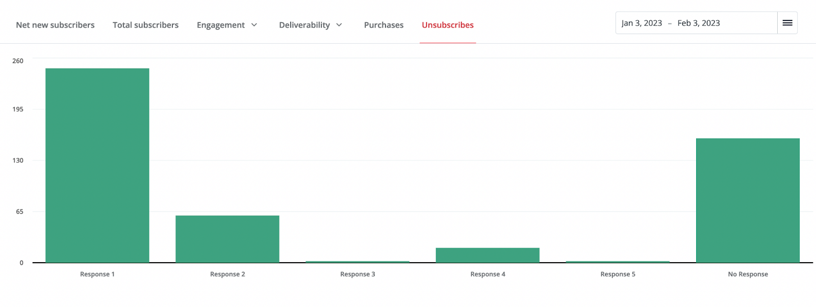
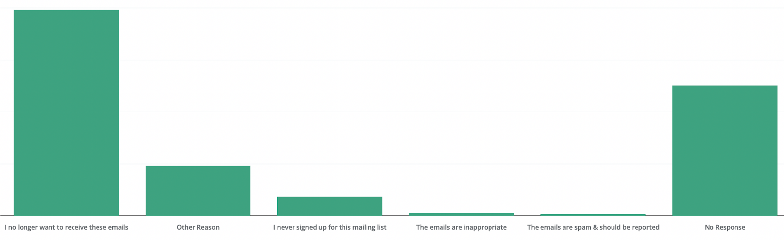
1) Reactivating unsubscribes is a tedious chore that could easily be productized
When you have a large list with tens or hundreds of thousands of subscribers, and you have a sophisticated workflow that involves many automations, sequences, and types of emails you send, there are going to be times where someone hits unsubscribe and changes their mind.
And because ConvertKit’s architecture is built around “1 list to rule them all” with many tags and segmentations to manage it, that means that an unsubscribe from one thing also unsubscribes them from everything else associated with our company. Sometimes people didn’t want that.
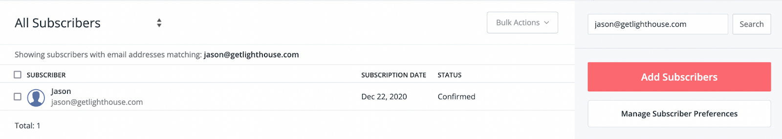
While looking up the answer to the question of, “Did subscriber X get the email they say is missing?” is a great experience in ConvertKit, fixing an unsubscribe is not.
Looking up an individual users tells you so much useful information all in one view.
Currently the workflow to get a subscriber reactivated is this:
Click to open up Intercom to ask support to help
Click through 2-3 prompts where Intercom tries to guess if they can automate answering your question
Finally get to chat with a support person
Tell them what the issue is
Provide a screenshot of an email proving the person wants to be resubscribed
Chat with the support person for any clarifications they need
Wait about 20 minutes to a few hours
Get the person resubscribed or deal with another round of questions with another person on the support team
The problem with this is two-fold:
It’s tedious as a user. Half of those steps feel extraneous and that they could be streamlined to make my life as a customer easier.
ConvertKit’s support team is burdened with managing the ticket and manually managing this process.
Now, I understand with spam laws you need to be really sure that someone wants to be resubscribed, and it happens often enough, it’s an option in Intercom. However, it would be better to just give me a form to fill out.
You could even put a button on the individual user’s profile or the Subscriber’s section to take me to the form, so it doesn’t require Intercom yet.
Then, when you click “Resubscribe” you can pop up a form that:
Makes clear the requirements to reactivate a subscriber
Asks for the same details the support team has to manually ask (the user’s email, a field to explain the situation, and a way to attach an image or other evidence)
Confirms the request has been received and provide an estimate for updates
This could then create a simple system in a very basic admin panel where you can queue up a list for someone on the support team to batch process these. Over time, you can then iterate on it to make their lives easier by both improving and streamlining this process, and adding other customer issues to it as well.
I’ve helped spec out these at multiple companies and they always are built faster than many people projected and save more time than most expected.
Having your support team cover for gaps in your product is a very expensive way to compensate for product issues and missing features. Fixing problems support identifies and making them more efficient at supporting customers are high leverage activities for product teams.
You’ll see in many of today’s items, support at ConvertKit is currently left to cover for exactly these kinds of issues.
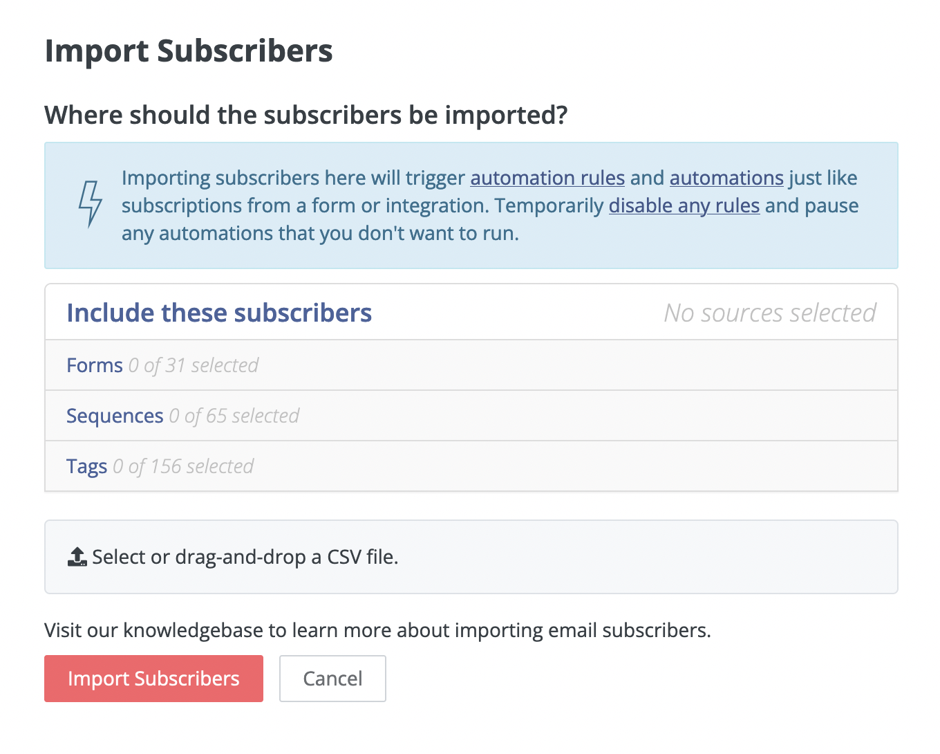
2) Import users doesn’t tell me what I need to know
Want to send your support team on a wild goose chase wasting hours of time to support a customer? This is how.
A simple query from engineering would save HOURS.
So now imagine you are importing an important list for a key customer that expects everyone to receive a certain email. You have everything configured in ConvertKit and the spreadsheet looked right to you when you checked it.
Yet, when you imported it, you expected 1,000 emails to be imported, and the confirmation email tells you 998 were.
Frustratingly, when I import a list, I get an email (like the one pictured above) saying how many were imported.
Yet what I don’t get are:
How many people did I try to import?
How many failed?
Who specifically failed?
What errors, if any, you have detected?
Those last 2 are really important. How else will you know who didn’t work.
Missing MailChimp…
Mailchimp used to do this exceptionally well, so that you could immediately diagnose an issue and fix it. Notice in the email it confirms exactly what ConvertKit does, and it also tells me about a failure, with a suggestion why, and a link to more details.
Typos happen. People are already unsubscribed (see 1!) and more. Letting me know which emails failed, and if possible, why, makes it easy to fix.
Rather than needing to start a support ticket, I can fix this issue myself relatively quickly.
But without the details MailChimp provides, do you really think I’m going to guess and check line by line myself? Unlikely.
Telling me how many did not successfully import and who failed at least let’s me try to fix it myself before contacting support. If you also have error messages that are customer readable (like Mailchimp mentioning syntax) you’d save customers TONS of time and mostly eliminate support needing to spend tons of time investigating.
As just one example, recently, I had a ticket run for almost a full week over 1 customer email not importing properly. It was handed off at least 3 times across support before we finally figured out the issue. That was frustrating for me, and costly for the ConvertKit Support team who repeatedly had to start over as they handed off the ticket.
3) #littlebigdetails Make the import flow better
There a bunch of ways to improve the import process. The elements are already there with today’s interface:
The current view when you’re importing a CSV
This is already an efficient pop-up, but when you are a power user and have dozens of each category, it gets unwieldy and mistakes are easy to make.
To improve this view, I would add:
1. Quick search in each section.
This would make my life sooo much easier and faster to import, so I don’t have to scroll through long lists of categories. Best of all, this functionality already exists.
When I add a selected user to a sequence, ConvertKit does have search in that view (pictured below). Why not implement the same in import, too?
2. Show what I picked in the collapsed view.
When you are importing a list, you pick out any forms to assign the new subscribers to, sequences they should start receiving, and tags to add. This is core to making your orchestrations in ConvertKit do what you need it to; this is how you segment your audience, trigger the right emails, and manage your master list effectively.
As you set your forms, sequences, and tags, you expand and collapse them one at a time. Ideally, when I collapse one of those lists, I want ConvertKit to show me which ones I selected so I can quickly review everything before hitting submit.
My crude mockup combining the import pop up with the add subscribers to sequence pop up behavior.
When you are doing an import, it can be a stressful moment, because a mistake will have people get the wrong email (or potentially many wrong emails). Having the clear sanity check (like ConvertKit has when you’re about to send a Broadcast) would help, and this is a simple way to accomplish that.
3. Add a working spinner to the page.
Sometimes I have to click twice on the “Import Subscribers” button, or it’s not clear if it’s working. Adding a spinner (or progress bar) would let me know it worked and to be patient while it works.
Note: Research shows people are MUCH more patient with a spinner or other loading signal; the rule of thumb I’ve found is that customers are willing to wait 2-3 seconds at most on their own, then that grows to 10-15 seconds with a spinner. Add some messaging to read during the spinner and they’ll wait as much as 45 seconds.
Each of these items is a nice win, that in total takes the import process from okay to exceptional.
These are also the kinds of things that make great quick wins to mix in along with bigger projects. One of these is likely a single point ticket in your project management tool.
Best of all, few things boost the morale of a tired engineering team like feeling like they can ship some things measured in hours or days instead of weeks or months, especially if they also get to hear from happy customers that love the updates they made.
4) Give more thoughtful ways to manage tags
My team and I have made hundreds of tags at this point. This is only growing, because ConvertKit’s support and account management teams have encouraged us to make more tags to further help us segment, target, and understand our subscribers.
As it is, these tags are in a massive list that you endlessly scroll in the sidebar of the Subscribers page. The tags are listed in alphabetical order with the number of subscribers there are, and that’s it.
Given the many purposes of tags, the big win would be making it easier to view them for various reasons.
Organize poll results and other jobs for tags
For example, if you have me do a poll where I’m measuring clicks of various options in the email we send (a clever suggestion from your account management team), allow me to view those results as a special view in the Broadcast results area, instead of having to do a CMD+F in my browser to find it:
Then, for viewing the rest of the tags info in the Subscribers tab, consider the jobs that customers want to get done with their tags.
The goal should be to make it easier to do each of those jobs based on how frequent those jobs are needed across the ConvertKit user base (surveys and understanding the segmentation of your user base are great for figuring this out).
Create tags when in the flow to tag subscribers
It would also be a big help to be able to create a new tag in the flow of looking to add a tag. Since ConvertKit has a great search here to try and find the right existing tag, you’re less likely to miss one, but then you may also want to create one right there.
Not likely the exact spot for the button, but illustrates it would be helpful to have somewhere in this pop up.
For example, I recently had a broadcast that went to what was a combination of a variety of groups. When I look at the broadcast results, I’d love to be able to tag everyone in that group, and not have to navigate to Subscribers, scroll all the way to the bottom of my list of 160+ tags, and click + Create a Tag, then go back to the broadcast and tag them.
Like much of this list, it’s all about understanding customer workflows and removing friction from the tasks customers are trying to complete.
5) #DesignCrimes Fix the blue on blue stack bar charts
The product team that shipped this missed the mark. Who can make sense of this?!?!?
Let’s look at the issues here with what is supposed to be a breakdown of how our 7 landing pages and forms that drive our subscribers are performing:
The bars are all the same color
There are only 2 shades, despite many more than 2 forms
There’s no legend to tell what each piece of a bar is (only hover tells you one piece at a time)
Sometimes the same color is displayed twice in a row
While I understand if you have a lot of forms you can’t have 500 colors, but you could at least have 8 (ie- ROYGBIV plus black/gray) and then potentially add patterns or shades to the bars, which in particular would help with accessibility (i.e.- colorblind people).
Examples of patterns added to a bar to differentiate beyond color
Add those additional colors with a legend or color code and you’d significantly improve the experience.
And to truly make this a WOW, let me:
Check and uncheck some of the forms to more easily compare some, but not all of my forms
Instead of stacking the bar chart, put them side by side so I can more easily tell which bars are clearly the best performing
Helping your customers be smarter is a key part of the process of making a good product, especially in the field of marketing. If your customers can’t understand how their forms and giveaways are performing, nor track the progress of experiments, it’s leaving a lot of value out of the product.
6) Add labels to the Unsubscribes bar chart
Another place to make email marketers smarter is the unsubscribes page. It’s nice that Convertkit added the survey to find out why people unsubscribed, but then the answers are hidden:
There’s *plenty* of room below those bars (which are standard answers ConvertKit set) so I can immediately analyze it instead of having to hover on each one.
I would love to be a fly on the wall to understand this compromise that led to a view like this considering:
The answers are hard coded. Every customer sees the same 6 options.
The chart is thus displayed the same for each customer
All of the options are 8 words or less so could fit in a similar font below each bar.
I quickly made the answers using “Inspect Element” in my browser in and this how they look:
I would take this over the hover as is, but I think a great front end engineer would happily make the couple of longer answers wrap to a second line and center under their appropriate bar.
You may also want to increase the font of those labels for accessibility purposes; a middle aged marketer with bi or tri-focals is going to have a hard time with that small of a font, and there’s plenty of room below the bars to go with a bigger font.
7) Make form analysis 100X better
This is the “Reports” tab for one of the many ways we get subscribers to Lighthouse:
As you can see, we get a lot of traffic to our blog. Since this CTA was shown to virtually every visitor, we have a low conversion rate, but still got a bunch of conversions from it.
Now, the problem with this is: What do I do with this? It’s not particularly actionable nor helpful:
It lacks enough granularity: Rounding to the fraction of a percent means it’s hard to tell if a change did anything for such a form display. It would help to provide at least 2 decimal places, especially when dealing with large numbers of visitors or a < 1% conversion rate.
No chart nor graph: I can’t track any trends over time. What if I ran a copy experiment? No trend over time means I can’t see if an experiment is winning, nor if a form’s performance is declining.
No way to note experiments: Even having a text-based list below a chart with what we changed would give us the context we need (which right now is awkwardly noted in Basecamp and a Google Doc). However, the best would be Google Analytics style annotations to a chart:
Beyond the list of Visitors and Conversions, the other thing you’ll notice is the list of “Top Referrers” on the page.
Unfortunately, this basically says “Search Engines” over and over, which isn’t actionable. It would be much more useful if it told me what page people were on when they subscribed to it. Then, I’d know which blog posts are really converting.
Especially for some of our custom forms that are for specific giveaways, it would be nice to be able to see if certain pages are doing particularly well or poor. Then we can act on the info it’s providing around conversion rates to recognize any copy tweaks or experiments we should do as well as understand what’s working best.
All of this is about making being a performance marketer smarter, better, and work faster.
The alternative is to do hacky things like my team will track experiments in Basecamp, note the conversion rate, and then check back in a month and see if the displayed cumulative conversion rate went up or down. All of that could and should be done inside ConvertKit.
8) Give me a way to organize sequences! How about some folders?!?
We have 65 sequences at Lighthouse (and counting). This is because we use ConvertKit for a variety of things like:
Drip series for each of our giveaways to grow subscribers
A welcome series for every new subscriber to our blog
Dozens of variants on our course sequences when customers pay to have various customization made to them.
As you might imagine, it’s quite unwieldy to have so many sequences. Currently, the only options to organize the view on the Sequences page are sorting in alphabetical order, chronological order, or a variety of options I’ve never found a use for:
Now, this is not a sexy feature, but letting me create folders (or something like them) would be tremendously helpful. I could group things by topics and purpose, as well as archive sequences that are of no use anymore other than as an old record.
Importantly, this also helps avoid mistakes. Naming conventions are super important when you get long lists, and if you can organize things into folders, you can make it safer by putting things in a set folder for someone.
With extra organization like archiving and folders, your team is much less likely to accidentally choose something named similarly that isn’t what they should be working on.
9) 3 Quick UX wins for ConvertKit sequences
As you can see from the previous item, my team and I use sequences *a lot*. Because of that, we see a lot of the issues that come up in the UX of sequences.
Here’s 3 simple fixes that would remove points of friction and frustration.
1. Let me scroll in a sequence to switch between steps without having to go to the very bottom of the content.
In a sequence, you have two parts: The text in the email, and the list of all the steps in your sequence in a sidebar. If you have a long email (like our courses) then to scroll and switch from Email 1 to say email 8, 10, or 12 in a sequence, you have to scroll all the way to the bottom of that email, and only then do the additional emails in the sequence become visible and thus clickable.
The simple answer here is to separate scrolling between the two elements.
2. Let me more easily re-send a sequence to a customer when they request it.
Other than re-subscribing people that had issues or accidentally unsubscribed, the number one thing we deal with is people can’t find an email in a sequence, so we need to resend it to them.
The ConvertKit support team company line is that we should copy and paste the entire message and subject line to make a broadcast to send to each person. That’s an incredibly tedious process to send a couple of people an email, especially when links often break and the formatting doesn’t come through in the process. Now, I can send a “Test Email” easily, but you limit those. I understand this is to protect against spammers, but you can use logic on that, such as only letting me send to people already in the sequence, or subscribed to our general list.
3. When I look at an individual user, and I check their sequence page, add a button to add them to a sequence!
One of the best things you can do in a product is let me do the things I want to do where it makes sense to do them. Supporting our customers often means looking up a specific user to see if they received an email.
When I look up subscriber, it’s great to have all the info on the user available on the subscriber’s profile, like we pictured before:
All I’d like to do is add to the Sequences tab a button for adding this subscriber to another Sequence. This let’s me complete a support activity for a customer where I am. As it stands, I need to take another 3-4 steps to complete the same action.
—
Adding small fixes and improvements in your product are great ways to boost morale for your engineering team and delight customers. Those are 3 that would make a big difference for my team and I when it comes to using sequences.
10) On sequences, tell me who is on what step.
The #1 thing I miss from MailChimp is that in any sequence I can get a pop up of a list to see:
Who is in the queue to get a sequence step
When they group will get emailed that next step
In Mailchimp, it’s part of the details on a step:
Clicking on the “Queue” then pops up a list of who is in the group to get the email associated with this line in a sequence:
This is big for 2 reasons:
It’s a helpful sanity check to make sure you have your logic correct for a step in the sequence. It can be nerve-wracking to not know for sure it’s right.
Any changes you just made are confirmed by seeing if the way you tweaked the logic now changed the existing members of a given step’s queue.
If a customer has a question or issue, you can confirm they’re properly in a sequence by literally checking the step and seeing for sure that they’re at the step you expect. You can then confidently tell them when they’ll get that next email instead of guessing or having to ask support to check.
In both cases, I currently have to message ConvertKit support and often it gets passed around and escalated before I get a response. This is pretty annoying if I’m trying to close out a customer ticket on my side, and is an expensive task for their support team.
Why might ConvertKit not have fixed these things?
Now, this is quite the list. It’s hard to expect any company to be perfect, but you can see there’s a mix of big and small things missing from the experience in ConvertKit.
The question then becomes why might ConvertKit not have built or fixed these things?
Here’s a few thoughts as to why…
1) They have more important things to focus on
One of my favorite frameworks I’ve ever learned about is “Olsen’s Hierarchy of Needs.” In a simple, easy to understand image, it explains how you should prioritize product development:
This was created by Dan Olsen, who was the VP of Product at Friendster. This was a predecessor to Facebook and MySpace that was very early in the social network game.
Unfortunately, Olsen created this out of some painful lessons learned. Scaling, product speed, and functionality issues ultimately doomed Friendster.
I have no idea what the situation may be internally at ConvertKit, but if there are core functionality and scalability issues that they’re putting the majority of their engineers on, then that is 100% the right decision.
Making sure emails send when they’re supposed to and arrive where they’re sent is more important than any of the things I’ve listed above.
However, a number of these are what I would expect can be quick wins and quick fixes. Those items are perfect to have your engineers do as a break from, or in between, major tech debt projects.
2) They commit the cardinal sin of featuring voting.
Not surprisingly, spending even a minute on the ConvertKit feature voting site, I see a number of the common problems:
Spam: Two different consultancies have posted themselves multiple times for reasons I don’t understand. They’re showing on the first page repeatedly, which has nothing to do with feature requests or product feedback….
People feeling unheard: Here’s someone talking about having a problem for *2 years*. And the response basically said, “Sorry, not yet” with no effort to help them with a workaround.
The system is bloated: It’s not just for feature requests, actually. There are dozens of categories of things in the “community”, making it incredibly noisy. It’s unreasonable for any customer to expect they’ll truly be heard in all that noise.
And those reasons, are in addition to what typically causes feature voting systems to fail:
Collecting features without understanding the real underlying problems causing the customer to request something.
Distracting people with all the noise of other requests causing them to forget to submit their feedback.
Yet another log in and account to create just to send feedback. Every bit of friction will lose some people.
A lack of context makes it impossible to tell what is a “must have” vs. “nice to have” request.
The ConvertKit community site may be great for feeling like they’re listening to and creating a community for their customers, but from a product development perspective, it’s a false idol.
Any time spent by the product team there, and the damage done to not really listening to customers prevents them from making the best, customer and data informed decisions they could.
3) They don’t seem to talk to a lot of customers
You’d be surprised how many product managers talk to few, if any, customers. You really are in the top 10-20% of all PMs if you make an effort to do so with much regularity.
I can’t say for certain what the habits are of every PM and designer at ConvertKit. However, I can say my experience as a customer for 2+ years is not good:
I’ve never received a survey from their product or design team. I did recently get one from marketing, but none of it included any product questions. It was all demographics.
I’ve never received an invitation to a customer development interview, user testing, or even to be added to a list they may draw from for those.
I’ve never seen an email, pop up in Intercom, nor any other format where the product team was trying to create direct communication with customers.
I’ve never received a follow up message from a designer nor product manager to ask any questions about feedback that the support team has promised they’ve logged or passed on to product.
Now, it’s possible I’m just unsubscribed from some of those things, and didn’t realize it. Or something about our use case and business type disqualifies us from being a fit for customer interviews.
Or maybe I’m supposed to do something at the community page that I don’t know. However, if that is the case, then the support team should be better trained to tell me about that, because I’ve asked them before and not been told that.
Intercom listens to their customers often. Here’s an example I received today.
Regardless of how they do it, the key is that there are opportunities to engage your customers at every step of the way, from prioritization to developing and scoping a feature, to pre and post launch testing.
Many of the issues I covered today could have been fixed by getting closer to the customer during each of those steps.
And that’s the beauty of making talking to customers a key part of your product development process and culture. You can create all of these benefits:
Make sure you build the right features at the right time: When you talk to your customers, you learn if the next feature is actually solving an important problem for them. Prioritization becomes “what’s best for the customer?” instead of internal battles of opinion.
Fixing issues before you build them: Interviewing customers can also include getting feedback on mockups, clickable prototypes, and other early designs to make sure you’re on the right track and fix things before costly rewrites are required.
Iterating from good to GREAT: You learn about the little big details that matter to customers and the keys to making them super happy when you take the time to speak to them regularly.
Through all of this, you learn how to maximize the time and efforts of your design and engineering teams. Many of the problems and suggestions I’ve made today could have been caught when the features were last iterated on or initially built, if they knew to incorporate them.
Talking to customers is hard. Building a customer driven company is even harder.
As an individual PM, having a strong set of habits to talk to customers and gather actionable data on what to build is a very difficult job.
Yet, it’s understandable why it doesn’t happen; it’s also a deep set of skills to build.
This is why so many PMs and companies don’t do a good job of it; many PMs don’t want to do the work, and many others don’t know how.
If you want to learn how to do it, check out some of these other posts that can help you on your journey to become a customer driven product manager:
Are you following what’s happening in the world of AI? Have you been asking questions of ChatGPT and trying out the various text to image AIs?
Whether you are new to the field of AI, or an eager follower, you’re going to love this episode of Practical Product.
In this episode, my good friend and fellow product-minded founder, Lazar Stojkovic talk about all the exciting things we’re seeing in AI. We talk about what we’ve liked and not liked, the controversies and opportunities, and most importantly, what every PM should be doing to think through using AI in their job, and at their company going forward.
The most exciting developments in AI + what product leaders need to be thinking about
On this episode, we dive deep into the latest developments in AI. Lazar and I have both spent a bunch of time trying various AI powered tools, so we’re able to provide a realistic evaluation of them, and help point you to the best ones to check out.
We also tackle the most important questions for you as a product manager and leader:
What should PMs do to prepare for a world with AI?
How can PMs get their teams involved in discussions about AI?
Highlights of the episode include discussing:
(1:09) – Introducing Lazar
(3:05) – Thoughts on ChatGPT
(8:19) – Is AI actually taking people’s jobs?
(18:44) – The pictorial side of AI
(30:31) – 10x-ing AI, applications and potential negative outcomes
(46:27) – What to look forward to with AI
(53:44) – How will the costs of AI impact pricing and how you can use them in your product?
(57:51) – How should Product Managers be thinking about AI in their products?
(1:21:12) – What could the future of AI may look like?
Key Show Notes & Further Reading:
We covered a lot of ground in this episode, so we have a ton of links for you to check out.
The AI basics:
ChatGPT – A chat based system by OpenAI that can provide written answers from a text-based prompt
GPT-3 API – An API by OpenAI that allows you to bring GPT into your product or service.
Replicate – Open source cloud API for running AI models
Lore AI Newsletter – A free newsletter discussing business and creative applications for AI