If you’re a company that cares about listening to your customer, there’s a good chance you’ve at least thought about adding a feedback widget to your product.
You’ll notice they’re particularly common in LLM products like ChatGPT, Perplexity, and Claude, where they appear right below the AI’s response to your prompt with a simple thumbs up and thumbs down:
What are your customers thinking?
One of the great things about website feedback widgets is that they help you answer that all important question: What are my customers thinking when using my product?
While you can send surveys, schedule interviews for deep dives, or tell customers to email you, few things are as convenient for them as being able to send you feedback in the moment while using your product.
That’s why so many companies have decided to build their own feedback widgets to embed inside their products.
As I’ve been researching and building Product Arrow, I’ve seen dozens of widgets across the products I use regularly and new ones I’ve been trying. And in doing so, I’ve found a few widgets that stand out as particularly beautiful, clever, or helpful.
Today, I want to share those with you, so you can consider adding some of their style or functionality to your product, too.
It’s a good question, and an important one for any good product leader to think about.
While designers work painstakingly on developing their eye for design, product managers have many things they need to master across a wide variety of fields.
Yet, it can be incredibly helpful for PMs to have their own sense of taste; it benefits them and their teams in a variety of ways:
You can more easily appreciate quality work from your designer, knowing what to praise and recognize.
You avoid suggesting ill-advised things that would hurt the user experience or drive your designer crazy.
You can help raise the bar for your engineering team, by making useful critiques during the testing phase of releasing a new feature that otherwise only your designer would.
You can more easily find good opportunities for inspiration to bring into your product from other apps, sites, and tools you use and discover.
You’ll earn the respect of the rest of your product team as they see you make quality suggestions, and catch valid issues.
That all sounds great, but… how do you do that?
Or, if you’re a senior product leader, how can you teach others to have more taste? It’s certainly better to teach it than wait for it to naturally develop.
Today, I want to teach you one of my favorite, light-weight ways to help develop taste as a PM. It’s something I *looked forward to* early in my career when I was learning, and has kept my skills sharp as I now teach others the same way.
Taste Sessions: How to Develop Design Sense in You or Your Product Managers.
You don’t have to be Tim Gunn to help teach people to have better design sense. All you need is a simple routine and a little prep.
What you’ll do is set aside some time for a special meeting I’ll teach you to have. The key components of the meeting are as follows:
Meet once a month: Make it a recurring event on everyone’s calendar so that you know it’s coming and can prepare/anticipate it accordingly.
Choose an app or product category: Each month, choose a category or product type that you and the team will all download or visit and try out. This works for websites and mobile apps.
Ask everyone to note a few things they like and don’t: If you have limited time in the meeting, ask people to prepare in advance. If you have more time, then you can do all of this live in the meeting.
Go over the apps everyone downloaded together: Knowing that at least everyone has downloaded all the apps or visited & signed up for their products, you can now go app by app reviewing them for good, bad, and ugly of each one.
Get specific about the good, bad, and ugly: When you or anyone else bring up something they have strong feelings about, take time to dig into why. Make it a discussion. Why is that interface ugly/clunky/awkward? What’s smooth or delightful about that screen, animation, or feature?
Praise your team members: Praise is like watering flowers. To develop their taste, be sure to call out and praise the things you really like they noted.
Suggest where you can apply this to your product: All of this work isn’t just theoretical exercise. It’s a great way to find inspiration for your product. Challenge your team to think about how the best things they saw can be applied to current and future projects.
I know it’s a cliche on the internet, but it’s true here: in just 7 simple steps, you can develop you and your team’s taste.
Here’s a few more tips around these Taste Session meetings to really run them like a pro.
1) Zoom is GREAT for this!
Too often, remote work makes things harder. I’m still looking for a good way to whiteboard remotely and have the same energy and emotion as being in person.
Yet, in this case, Zoom is a huge asset, especially if you’re looking at mobile apps. When you share your screen on Zoom, one of the options you have is to pair your iPhone, which then means everyone dialed in can now see the presenter’s phone in giant form. This is perfect for calling out little details that you’d never see looking over someone’s shoulder.
2) Have someone take notes and share them across the team
As much as this is about learning about different designs, it’s also about making your product better. Having a record of past discussions with call outs (and if you’re a pro, screenshots) to how these things can apply to your product, ensures that these discussions shift from the academic exercise to the practical application.
Best of all, if you save these in an easy to reference place, when you’re building new features, you have a library of interesting, high quality interfaces you can pull out and reference in your product spec or product thesis. This will impress your designers who are used to having to do most of the work to find inspiration.
3) Embrace your inner critic
The beauty of this process is that it’s fun, it’s easy, and it’s safe. Rather than only talking about products when you’re critiquing each of your team’s own work, you set up a safe place to critique other people’s products.
This helps people learn to be more vocal editors; since the creator isn’t in the room, it’s easier to say something they don’t like or doesn’t work for them just as much as what they love. And a big part of taste is recognizing all the ways you can do things wrong, frustrate users, or confuse them.
Establish the quality bar.
Being a good PM means being willing to stand up when something doesn’t meet the necessary quality bar. You can use these discussions to talk about tradeoffs like this and where your company feels the standard must be (i.e.- When would you delay a ship because it’s not good enough yet?)
4) Share responsibility
There’s not a ton of work to do to run a monthly meeting like this, but you do have an important decision to make: choosing the category or type of app/product.
One of the best ways to handle this is to rotate within your group who picks the app. Chances are, your example will inspire others to choose good categories. All they have to do is let everyone know a few days beforehand and the rest is the same each time.
Remember: Make it fun! You can learn from just about any app category regardless of what your app or software does. I’ve gotten great ideas for enterprise SaaS from consumer games, product led growth ideas from social networks, and many more unexpected crossovers.
5) When it’s your turn, be strategic
When it’s your turn to organize again (as you delegated to rotate through everyone) you should be strategic in your choices; for example, if your team is focused on onboarding experiments, you can focus on specifically looking at onboarding and choose a category and products you think does it well.
Don’t shortchange your efforts on this; leadership by example is one of the most important parts of making this successful. If you take looking at apps seriously, and choose a good category, so will your team. Yet, if you are careless, sloppy, or forgetful, it will be a lot harder for this habit to stick and grow with your team.
6) Encourage your junior team members to level up on their own
If some of your team members are very new to this, give them some reading to help raise their self-awareness and perspective when they use apps. This will help them both have a better critical eye, and most importantly, start to understand *why* they may like or dislike something.
The Design of Every Day Things: This book will change how you look at the products and objects you use every day. This then can translate to looking at software.
Don’t Make Me Think: This book lays out fundamental rules of web design. The title gives you the most important lesson of all: don’t make your users think, and teaches it well through colorful examples.
By meeting once a month, they’ll have time to chip away at these books; every time you meet, they will understand more and more, while not being dependent on this one meeting for their learning. They’ll also likely then impress their colleagues as their critical eye will seem to rapidly improve.
7) The Veteran Move: Invite Design in
I would highly recommend you start out with just you and other PMs at your company (or if you’re too small, PM friends at other companies). It gives you all a chance to get comfortable and sharpen your skills without fear of being judged by others.
However, as you do all get more comfortable and develop your critical eyes, consider inviting designers from your team to join. It’s a great way for your designers to teach your PMs a bit and for your PMs to earn some respect and build more rapport with people they work with regularly.
Keep in mind that the size of your group does change things. Once you have more than 6 people in your group it may become difficult for everyone to get a chance to speak. When that happens try the following:
Keep track of who participates: In large groups, it’s easy for people to fade into the background. Make sure that doesn’t happen by making note and calling on anyone too quiet or seeming to check out.
Call on junior team members first: It’s easy to agree with your boss whether due to intimidation, a demand to be a yes man, or simply wanting to sound smart. By calling on junior team members first none of those things can happen.
Split the group up: If your group is creeping into double digits, it’s time to split it up. It’s better to meet in small groups and everyone actively participates, than a large audience only watching. I personally prefer groups of 2-6, and would split any group larger than 8, but use your best judgment.
While a little preparation can go a long way here, the best thing you can do in these meetings is to be a good moderator. That’s how you recognize people are checking out, ensure junior team members participate, and see when the group is getting too big. You’ll also see who may work best so that when you split your group, you match people up well.
A little taste goes a long way…
Developing the skills of your PMs, or even honing your own skills, can be something that you put off week after week after week. It’s hard to get it to the top of your to do list.
That’s why rituals like a monthly Taste Session can be the best hack. With limited effort, you and your peers or PMs can improve your design sense.
Want help developing the PMs in your org? Feeling isolated as the only PM at your company? I coach product managers to help them be at their best. Whether you need help mastering interview customers, reducing churn, improving your stakeholder relationships, or teaching new PMs all the skills they need to succeed, I can help you.
Ever have a love-hate relationship with a product?
If you’re a product manager, designer, or UX-conscious engineer, you know how using products that don’t live up to their full potential can drive you crazy.
Today, I want to talk about a product that best personifies that feeling for me: ConvertKit.
Why I love ConvertKit
First and foremost, I want to emphasize I like a lot about ConvertKit, and I’ve been satisfied with them since switching from Mailchimp a couple years ago.
Mailchimp used to be the *gold standard* for UX. I loved their product and would often point people to their workflows as examples of good UX. I often could hire people with no experience and set them loose and they’d be able to figure out how to do everything they needed to easily.
Unfortunately, a couple years ago, it seems Mailchimp’s team decided that they needed to fix what wasn’t broken, so as that got worse, and some of their brand decisions also didn’t sit well with with me, I made the switch to ConvertKit.
Their offer to migrate our data was a HUGE selling point and we probably never would have switched without it.
Overall, their performance has been adequate and their support team has been excellent at filling in many of the gaps in the product. I also admire Nathan’s founding story and love some of the stories of what he does at the company, like doing podcast interviews of each new hire to introduce them to the team.
What I hate about ConvertKit
Now that my team and I are settled in a couple years removed from switching to ConvertKit, and we’re a pretty sophisticated user, there’s quite a few UX things that drive me crazy.
This post is about how ConvertKit could go from good to great, which is how you turn quiet users into raving evangelists.
It’s also how you significantly reduce the workload of your support team, who in many of the cases I’m going to share have to make up for the gaps in the product.
(Note: Wish your product could go from good to great? I’m a product coach and consultant who has helped many teams build the habits that create great products.)
10 Things I Hate About ConvertKit
When you’re using a product, you are trying to accomplish specific tasks. When they are easy and smooth, you often don’t notice and get on with your day. Sometimes, they do something clever and delightful, which then becomes memorable. It’s why I’ve started a thread of Little Big Details to call them out when I see them.
The following 10 things are a mix of big frustrations that have gotten in the way of key tasks my team wants to do, and those kinds of little big details that are the difference between a good enough product and a GREAT one.
And because I want this to be a constructive conversation, I try to present solutions where possible.
Let’s dive in.
1) Reactivating unsubscribes is a tedious chore that could easily be productized
When you have a large list with tens or hundreds of thousands of subscribers, and you have a sophisticated workflow that involves many automations, sequences, and types of emails you send, there are going to be times where someone hits unsubscribe and changes their mind.
And because ConvertKit’s architecture is built around “1 list to rule them all” with many tags and segmentations to manage it, that means that an unsubscribe from one thing also unsubscribes them from everything else associated with our company. Sometimes people didn’t want that.
While looking up the answer to the question of, “Did subscriber X get the email they say is missing?” is a great experience in ConvertKit, fixing an unsubscribe is not.
Looking up an individual users tells you so much useful information all in one view.
Currently the workflow to get a subscriber reactivated is this:
Click to open up Intercom to ask support to help
Click through 2-3 prompts where Intercom tries to guess if they can automate answering your question
Finally get to chat with a support person
Tell them what the issue is
Provide a screenshot of an email proving the person wants to be resubscribed
Chat with the support person for any clarifications they need
Wait about 20 minutes to a few hours
Get the person resubscribed or deal with another round of questions with another person on the support team
The problem with this is two-fold:
It’s tedious as a user. Half of those steps feel extraneous and that they could be streamlined to make my life as a customer easier.
ConvertKit’s support team is burdened with managing the ticket and manually managing this process.
Now, I understand with spam laws you need to be really sure that someone wants to be resubscribed, and it happens often enough, it’s an option in Intercom. However, it would be better to just give me a form to fill out.
You could even put a button on the individual user’s profile or the Subscriber’s section to take me to the form, so it doesn’t require Intercom yet.
Then, when you click “Resubscribe” you can pop up a form that:
Makes clear the requirements to reactivate a subscriber
Asks for the same details the support team has to manually ask (the user’s email, a field to explain the situation, and a way to attach an image or other evidence)
Confirms the request has been received and provide an estimate for updates
This could then create a simple system in a very basic admin panel where you can queue up a list for someone on the support team to batch process these. Over time, you can then iterate on it to make their lives easier by both improving and streamlining this process, and adding other customer issues to it as well.
I’ve helped spec out these at multiple companies and they always are built faster than many people projected and save more time than most expected.
Having your support team cover for gaps in your product is a very expensive way to compensate for product issues and missing features. Fixing problems support identifies and making them more efficient at supporting customers are high leverage activities for product teams.
You’ll see in many of today’s items, support at ConvertKit is currently left to cover for exactly these kinds of issues.
2) Import users doesn’t tell me what I need to know
Want to send your support team on a wild goose chase wasting hours of time to support a customer? This is how.
A simple query from engineering would save HOURS.
So now imagine you are importing an important list for a key customer that expects everyone to receive a certain email. You have everything configured in ConvertKit and the spreadsheet looked right to you when you checked it.
Yet, when you imported it, you expected 1,000 emails to be imported, and the confirmation email tells you 998 were.
Frustratingly, when I import a list, I get an email (like the one pictured above) saying how many were imported.
Yet what I don’t get are:
How many people did I try to import?
How many failed?
Who specifically failed?
What errors, if any, you have detected?
Those last 2 are really important. How else will you know who didn’t work.
Missing MailChimp…
Mailchimp used to do this exceptionally well, so that you could immediately diagnose an issue and fix it. Notice in the email it confirms exactly what ConvertKit does, and it also tells me about a failure, with a suggestion why, and a link to more details.
Typos happen. People are already unsubscribed (see 1!) and more. Letting me know which emails failed, and if possible, why, makes it easy to fix.
Rather than needing to start a support ticket, I can fix this issue myself relatively quickly.
But without the details MailChimp provides, do you really think I’m going to guess and check line by line myself? Unlikely.
Telling me how many did not successfully import and who failed at least let’s me try to fix it myself before contacting support. If you also have error messages that are customer readable (like Mailchimp mentioning syntax) you’d save customers TONS of time and mostly eliminate support needing to spend tons of time investigating.
As just one example, recently, I had a ticket run for almost a full week over 1 customer email not importing properly. It was handed off at least 3 times across support before we finally figured out the issue. That was frustrating for me, and costly for the ConvertKit Support team who repeatedly had to start over as they handed off the ticket.
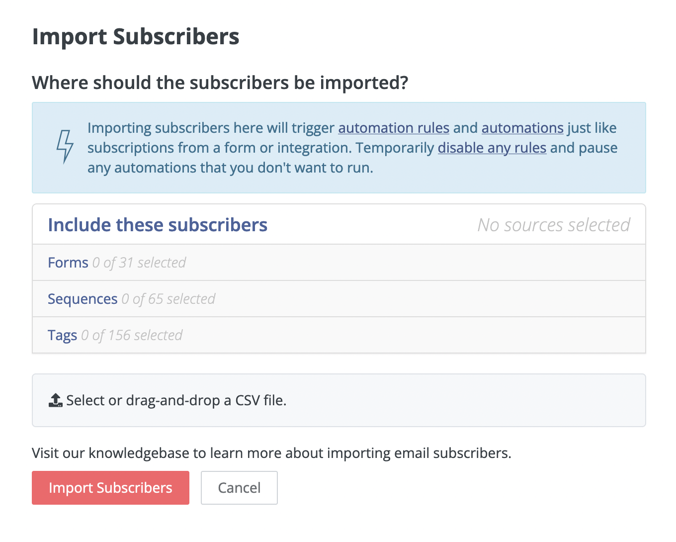
3) #littlebigdetails Make the import flow better
There a bunch of ways to improve the import process. The elements are already there with today’s interface:
The current view when you’re importing a CSV
This is already an efficient pop-up, but when you are a power user and have dozens of each category, it gets unwieldy and mistakes are easy to make.
To improve this view, I would add:
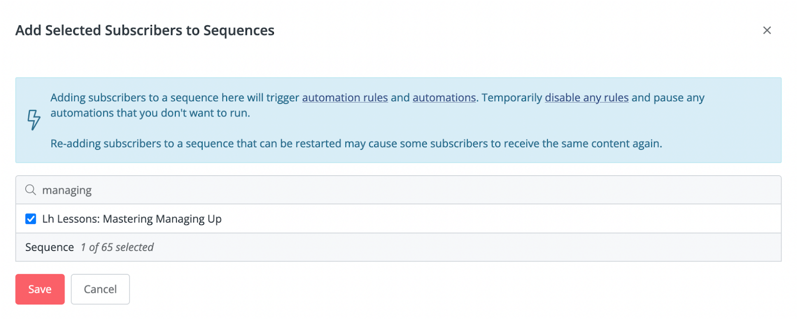
1. Quick search in each section.
This would make my life sooo much easier and faster to import, so I don’t have to scroll through long lists of categories. Best of all, this functionality already exists.
When I add a selected user to a sequence, ConvertKit does have search in that view (pictured below). Why not implement the same in import, too?
2. Show what I picked in the collapsed view.
When you are importing a list, you pick out any forms to assign the new subscribers to, sequences they should start receiving, and tags to add. This is core to making your orchestrations in ConvertKit do what you need it to; this is how you segment your audience, trigger the right emails, and manage your master list effectively.
As you set your forms, sequences, and tags, you expand and collapse them one at a time. Ideally, when I collapse one of those lists, I want ConvertKit to show me which ones I selected so I can quickly review everything before hitting submit.
My crude mockup combining the import pop up with the add subscribers to sequence pop up behavior.
When you are doing an import, it can be a stressful moment, because a mistake will have people get the wrong email (or potentially many wrong emails). Having the clear sanity check (like ConvertKit has when you’re about to send a Broadcast) would help, and this is a simple way to accomplish that.
3. Add a working spinner to the page.
Sometimes I have to click twice on the “Import Subscribers” button, or it’s not clear if it’s working. Adding a spinner (or progress bar) would let me know it worked and to be patient while it works.
Note: Research shows people are MUCH more patient with a spinner or other loading signal; the rule of thumb I’ve found is that customers are willing to wait 2-3 seconds at most on their own, then that grows to 10-15 seconds with a spinner. Add some messaging to read during the spinner and they’ll wait as much as 45 seconds.
Each of these items is a nice win, that in total takes the import process from okay to exceptional.
These are also the kinds of things that make great quick wins to mix in along with bigger projects. One of these is likely a single point ticket in your project management tool.
Best of all, few things boost the morale of a tired engineering team like feeling like they can ship some things measured in hours or days instead of weeks or months, especially if they also get to hear from happy customers that love the updates they made.
4) Give more thoughtful ways to manage tags
My team and I have made hundreds of tags at this point. This is only growing, because ConvertKit’s support and account management teams have encouraged us to make more tags to further help us segment, target, and understand our subscribers.
As it is, these tags are in a massive list that you endlessly scroll in the sidebar of the Subscribers page. The tags are listed in alphabetical order with the number of subscribers there are, and that’s it.
Given the many purposes of tags, the big win would be making it easier to view them for various reasons.
Organize poll results and other jobs for tags
For example, if you have me do a poll where I’m measuring clicks of various options in the email we send (a clever suggestion from your account management team), allow me to view those results as a special view in the Broadcast results area, instead of having to do a CMD+F in my browser to find it:
Then, for viewing the rest of the tags info in the Subscribers tab, consider the jobs that customers want to get done with their tags.
The goal should be to make it easier to do each of those jobs based on how frequent those jobs are needed across the ConvertKit user base (surveys and understanding the segmentation of your user base are great for figuring this out).
Create tags when in the flow to tag subscribers
It would also be a big help to be able to create a new tag in the flow of looking to add a tag. Since ConvertKit has a great search here to try and find the right existing tag, you’re less likely to miss one, but then you may also want to create one right there.
Not likely the exact spot for the button, but illustrates it would be helpful to have somewhere in this pop up.
For example, I recently had a broadcast that went to what was a combination of a variety of groups. When I look at the broadcast results, I’d love to be able to tag everyone in that group, and not have to navigate to Subscribers, scroll all the way to the bottom of my list of 160+ tags, and click + Create a Tag, then go back to the broadcast and tag them.
Like much of this list, it’s all about understanding customer workflows and removing friction from the tasks customers are trying to complete.
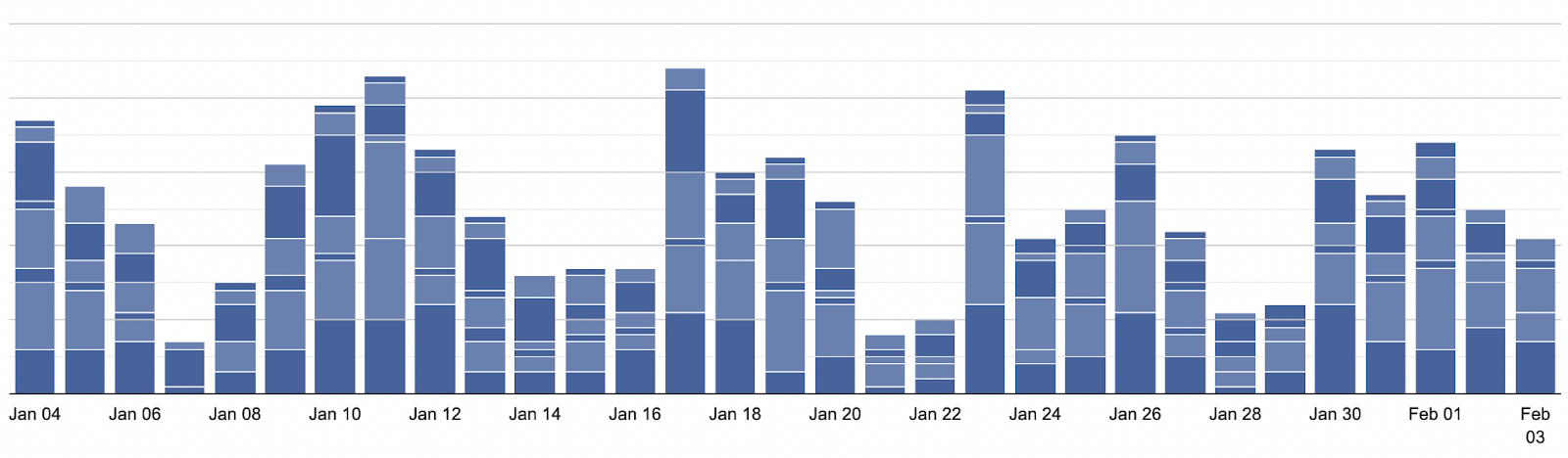
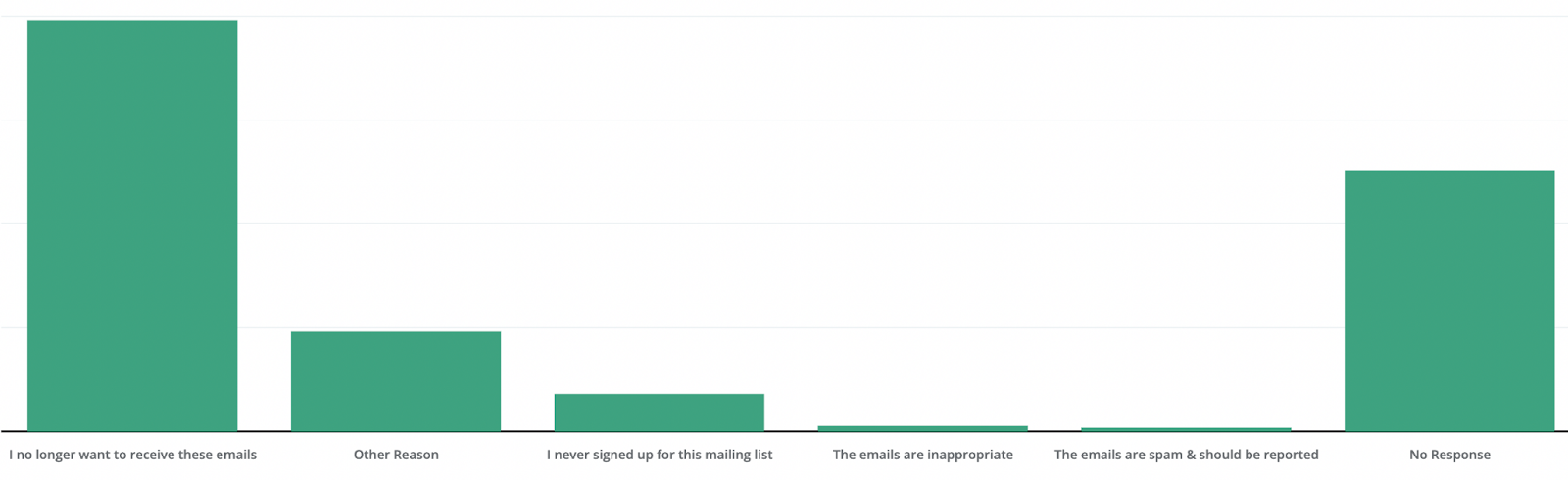
5) #DesignCrimes Fix the blue on blue stack bar charts
The product team that shipped this missed the mark. Who can make sense of this?!?!?
Let’s look at the issues here with what is supposed to be a breakdown of how our 7 landing pages and forms that drive our subscribers are performing:
The bars are all the same color
There are only 2 shades, despite many more than 2 forms
There’s no legend to tell what each piece of a bar is (only hover tells you one piece at a time)
Sometimes the same color is displayed twice in a row
While I understand if you have a lot of forms you can’t have 500 colors, but you could at least have 8 (ie- ROYGBIV plus black/gray) and then potentially add patterns or shades to the bars, which in particular would help with accessibility (i.e.- colorblind people).
Examples of patterns added to a bar to differentiate beyond color
Add those additional colors with a legend or color code and you’d significantly improve the experience.
And to truly make this a WOW, let me:
Check and uncheck some of the forms to more easily compare some, but not all of my forms
Instead of stacking the bar chart, put them side by side so I can more easily tell which bars are clearly the best performing
Helping your customers be smarter is a key part of the process of making a good product, especially in the field of marketing. If your customers can’t understand how their forms and giveaways are performing, nor track the progress of experiments, it’s leaving a lot of value out of the product.
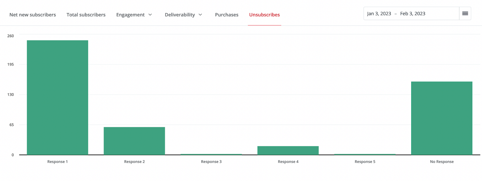
6) Add labels to the Unsubscribes bar chart
Another place to make email marketers smarter is the unsubscribes page. It’s nice that Convertkit added the survey to find out why people unsubscribed, but then the answers are hidden:
There’s *plenty* of room below those bars (which are standard answers ConvertKit set) so I can immediately analyze it instead of having to hover on each one.
I would love to be a fly on the wall to understand this compromise that led to a view like this considering:
The answers are hard coded. Every customer sees the same 6 options.
The chart is thus displayed the same for each customer
All of the options are 8 words or less so could fit in a similar font below each bar.
I quickly made the answers using “Inspect Element” in my browser in and this how they look:
I would take this over the hover as is, but I think a great front end engineer would happily make the couple of longer answers wrap to a second line and center under their appropriate bar.
You may also want to increase the font of those labels for accessibility purposes; a middle aged marketer with bi or tri-focals is going to have a hard time with that small of a font, and there’s plenty of room below the bars to go with a bigger font.
7) Make form analysis 100X better
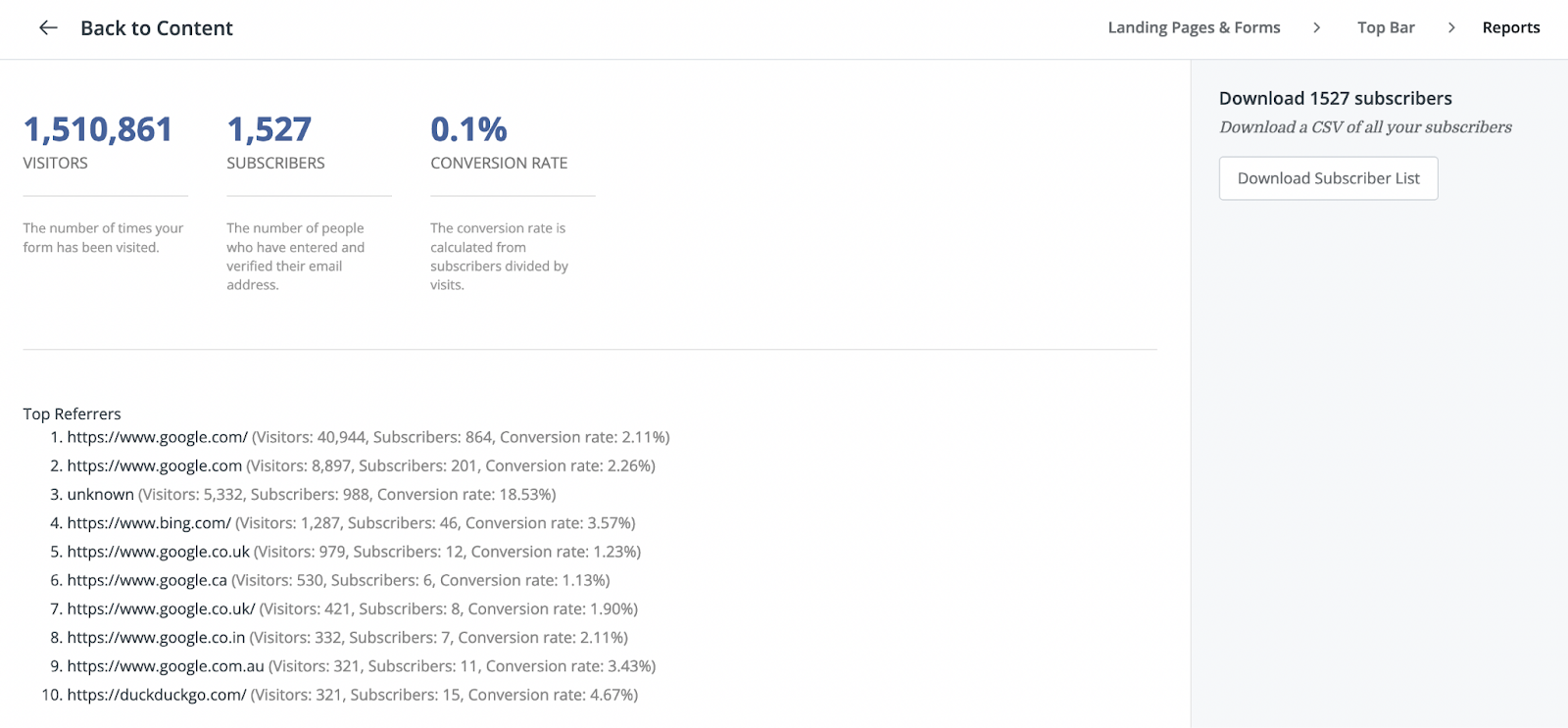
This is the “Reports” tab for one of the many ways we get subscribers to Lighthouse:
As you can see, we get a lot of traffic to our blog. Since this CTA was shown to virtually every visitor, we have a low conversion rate, but still got a bunch of conversions from it.
Now, the problem with this is: What do I do with this? It’s not particularly actionable nor helpful:
It lacks enough granularity: Rounding to the fraction of a percent means it’s hard to tell if a change did anything for such a form display. It would help to provide at least 2 decimal places, especially when dealing with large numbers of visitors or a < 1% conversion rate.
No chart nor graph: I can’t track any trends over time. What if I ran a copy experiment? No trend over time means I can’t see if an experiment is winning, nor if a form’s performance is declining.
No way to note experiments: Even having a text-based list below a chart with what we changed would give us the context we need (which right now is awkwardly noted in Basecamp and a Google Doc). However, the best would be Google Analytics style annotations to a chart:
Beyond the list of Visitors and Conversions, the other thing you’ll notice is the list of “Top Referrers” on the page.
Unfortunately, this basically says “Search Engines” over and over, which isn’t actionable. It would be much more useful if it told me what page people were on when they subscribed to it. Then, I’d know which blog posts are really converting.
Especially for some of our custom forms that are for specific giveaways, it would be nice to be able to see if certain pages are doing particularly well or poor. Then we can act on the info it’s providing around conversion rates to recognize any copy tweaks or experiments we should do as well as understand what’s working best.
All of this is about making being a performance marketer smarter, better, and work faster.
The alternative is to do hacky things like my team will track experiments in Basecamp, note the conversion rate, and then check back in a month and see if the displayed cumulative conversion rate went up or down. All of that could and should be done inside ConvertKit.
8) Give me a way to organize sequences! How about some folders?!?
We have 65 sequences at Lighthouse (and counting). This is because we use ConvertKit for a variety of things like:
Drip series for each of our giveaways to grow subscribers
A welcome series for every new subscriber to our blog
Dozens of variants on our course sequences when customers pay to have various customization made to them.
As you might imagine, it’s quite unwieldy to have so many sequences. Currently, the only options to organize the view on the Sequences page are sorting in alphabetical order, chronological order, or a variety of options I’ve never found a use for:
Now, this is not a sexy feature, but letting me create folders (or something like them) would be tremendously helpful. I could group things by topics and purpose, as well as archive sequences that are of no use anymore other than as an old record.
Importantly, this also helps avoid mistakes. Naming conventions are super important when you get long lists, and if you can organize things into folders, you can make it safer by putting things in a set folder for someone.
With extra organization like archiving and folders, your team is much less likely to accidentally choose something named similarly that isn’t what they should be working on.
9) 3 Quick UX wins for ConvertKit sequences
As you can see from the previous item, my team and I use sequences *a lot*. Because of that, we see a lot of the issues that come up in the UX of sequences.
Here’s 3 simple fixes that would remove points of friction and frustration.
1. Let me scroll in a sequence to switch between steps without having to go to the very bottom of the content.
In a sequence, you have two parts: The text in the email, and the list of all the steps in your sequence in a sidebar. If you have a long email (like our courses) then to scroll and switch from Email 1 to say email 8, 10, or 12 in a sequence, you have to scroll all the way to the bottom of that email, and only then do the additional emails in the sequence become visible and thus clickable.
The simple answer here is to separate scrolling between the two elements.
2. Let me more easily re-send a sequence to a customer when they request it.
Other than re-subscribing people that had issues or accidentally unsubscribed, the number one thing we deal with is people can’t find an email in a sequence, so we need to resend it to them.
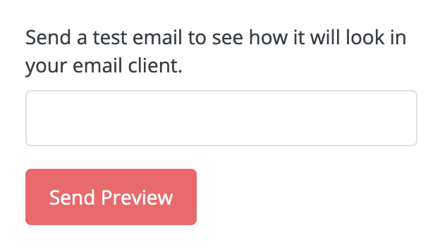
The ConvertKit support team company line is that we should copy and paste the entire message and subject line to make a broadcast to send to each person. That’s an incredibly tedious process to send a couple of people an email, especially when links often break and the formatting doesn’t come through in the process. Now, I can send a “Test Email” easily, but you limit those. I understand this is to protect against spammers, but you can use logic on that, such as only letting me send to people already in the sequence, or subscribed to our general list.
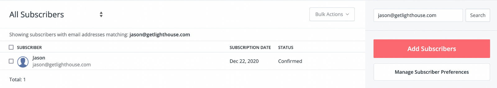
3. When I look at an individual user, and I check their sequence page, add a button to add them to a sequence!
One of the best things you can do in a product is let me do the things I want to do where it makes sense to do them. Supporting our customers often means looking up a specific user to see if they received an email.
When I look up subscriber, it’s great to have all the info on the user available on the subscriber’s profile, like we pictured before:
All I’d like to do is add to the Sequences tab a button for adding this subscriber to another Sequence. This let’s me complete a support activity for a customer where I am. As it stands, I need to take another 3-4 steps to complete the same action.
—
Adding small fixes and improvements in your product are great ways to boost morale for your engineering team and delight customers. Those are 3 that would make a big difference for my team and I when it comes to using sequences.
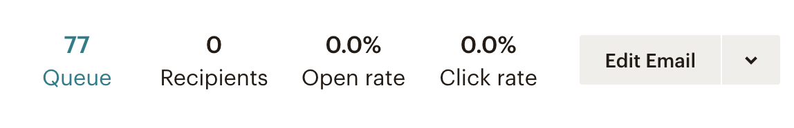
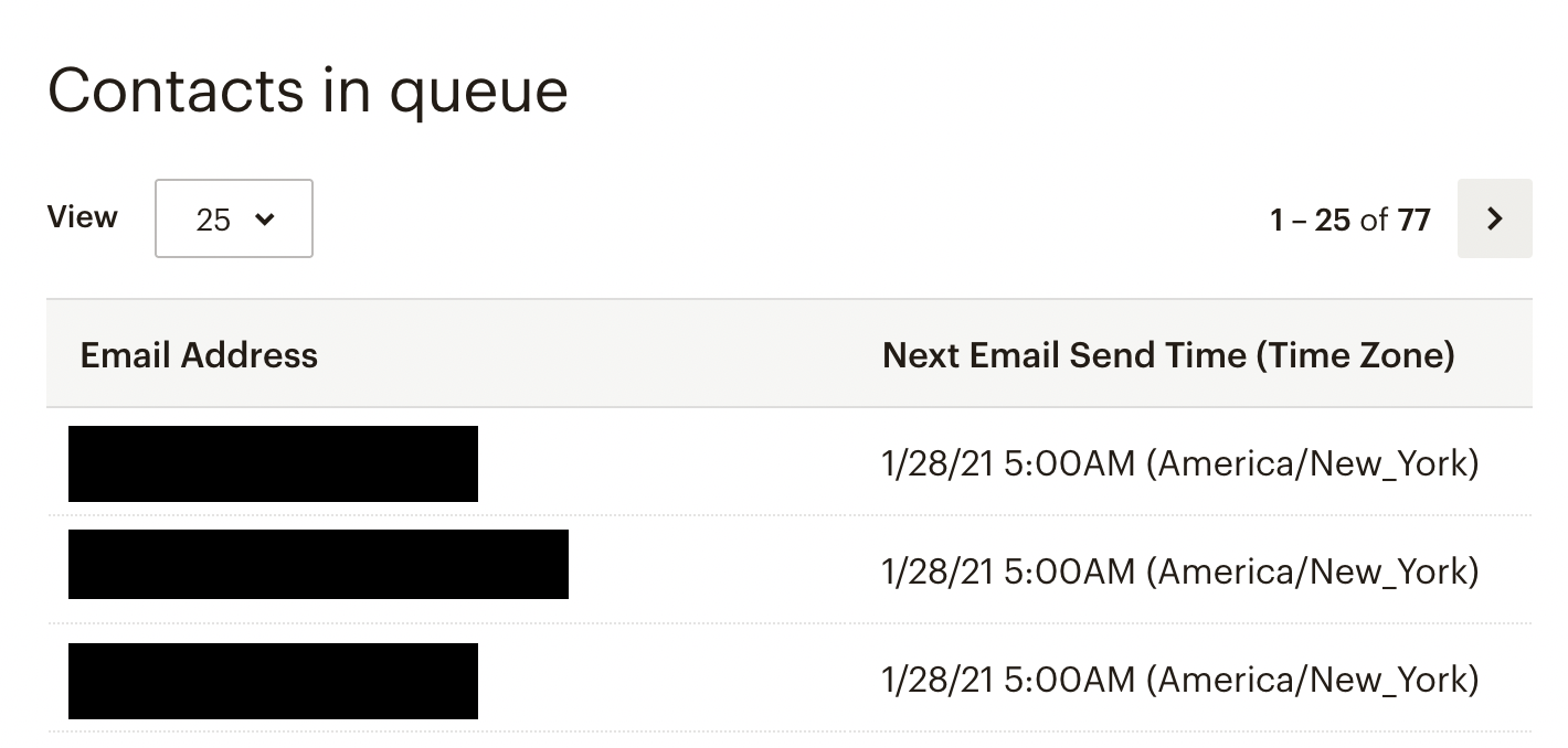
10) On sequences, tell me who is on what step.
The #1 thing I miss from MailChimp is that in any sequence I can get a pop up of a list to see:
Who is in the queue to get a sequence step
When they group will get emailed that next step
In Mailchimp, it’s part of the details on a step:
Clicking on the “Queue” then pops up a list of who is in the group to get the email associated with this line in a sequence:
This is big for 2 reasons:
It’s a helpful sanity check to make sure you have your logic correct for a step in the sequence. It can be nerve-wracking to not know for sure it’s right.
Any changes you just made are confirmed by seeing if the way you tweaked the logic now changed the existing members of a given step’s queue.
If a customer has a question or issue, you can confirm they’re properly in a sequence by literally checking the step and seeing for sure that they’re at the step you expect. You can then confidently tell them when they’ll get that next email instead of guessing or having to ask support to check.
In both cases, I currently have to message ConvertKit support and often it gets passed around and escalated before I get a response. This is pretty annoying if I’m trying to close out a customer ticket on my side, and is an expensive task for their support team.
Why might ConvertKit not have fixed these things?
Now, this is quite the list. It’s hard to expect any company to be perfect, but you can see there’s a mix of big and small things missing from the experience in ConvertKit.
The question then becomes why might ConvertKit not have built or fixed these things?
Here’s a few thoughts as to why…
1) They have more important things to focus on
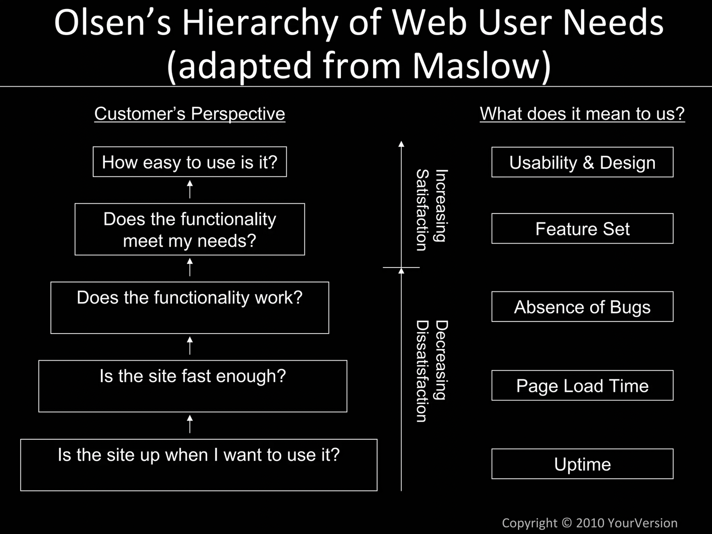
One of my favorite frameworks I’ve ever learned about is “Olsen’s Hierarchy of Needs.” In a simple, easy to understand image, it explains how you should prioritize product development:
This was created by Dan Olsen, who was the VP of Product at Friendster. This was a predecessor to Facebook and MySpace that was very early in the social network game.
Unfortunately, Olsen created this out of some painful lessons learned. Scaling, product speed, and functionality issues ultimately doomed Friendster.
I have no idea what the situation may be internally at ConvertKit, but if there are core functionality and scalability issues that they’re putting the majority of their engineers on, then that is 100% the right decision.
Making sure emails send when they’re supposed to and arrive where they’re sent is more important than any of the things I’ve listed above.
However, a number of these are what I would expect can be quick wins and quick fixes. Those items are perfect to have your engineers do as a break from, or in between, major tech debt projects.
2) They commit the cardinal sin of featuring voting.
Not surprisingly, spending even a minute on the ConvertKit feature voting site, I see a number of the common problems:
Spam: Two different consultancies have posted themselves multiple times for reasons I don’t understand. They’re showing on the first page repeatedly, which has nothing to do with feature requests or product feedback….
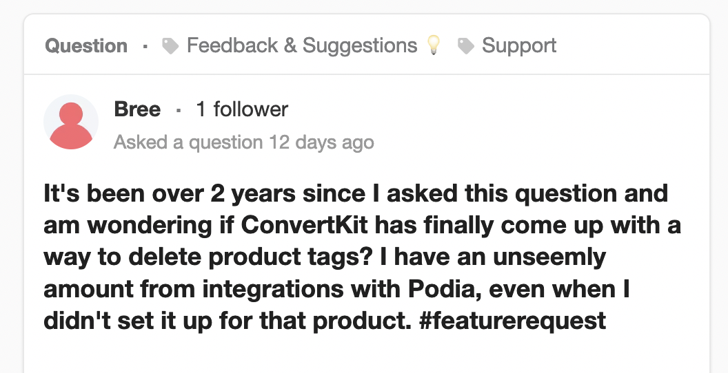
People feeling unheard: Here’s someone talking about having a problem for *2 years*. And the response basically said, “Sorry, not yet” with no effort to help them with a workaround.
The system is bloated: It’s not just for feature requests, actually. There are dozens of categories of things in the “community”, making it incredibly noisy. It’s unreasonable for any customer to expect they’ll truly be heard in all that noise.
And those reasons, are in addition to what typically causes feature voting systems to fail:
Collecting features without understanding the real underlying problems causing the customer to request something.
Distracting people with all the noise of other requests causing them to forget to submit their feedback.
Yet another log in and account to create just to send feedback. Every bit of friction will lose some people.
A lack of context makes it impossible to tell what is a “must have” vs. “nice to have” request.
The ConvertKit community site may be great for feeling like they’re listening to and creating a community for their customers, but from a product development perspective, it’s a false idol.
Any time spent by the product team there, and the damage done to not really listening to customers prevents them from making the best, customer and data informed decisions they could.
3) They don’t seem to talk to a lot of customers
You’d be surprised how many product managers talk to few, if any, customers. You really are in the top 10-20% of all PMs if you make an effort to do so with much regularity.
I can’t say for certain what the habits are of every PM and designer at ConvertKit. However, I can say my experience as a customer for 2+ years is not good:
I’ve never received a survey from their product or design team. I did recently get one from marketing, but none of it included any product questions. It was all demographics.
I’ve never received an invitation to a customer development interview, user testing, or even to be added to a list they may draw from for those.
I’ve never seen an email, pop up in Intercom, nor any other format where the product team was trying to create direct communication with customers.
I’ve never received a follow up message from a designer nor product manager to ask any questions about feedback that the support team has promised they’ve logged or passed on to product.
Now, it’s possible I’m just unsubscribed from some of those things, and didn’t realize it. Or something about our use case and business type disqualifies us from being a fit for customer interviews.
Or maybe I’m supposed to do something at the community page that I don’t know. However, if that is the case, then the support team should be better trained to tell me about that, because I’ve asked them before and not been told that.
Intercom listens to their customers often. Here’s an example I received today.
Regardless of how they do it, the key is that there are opportunities to engage your customers at every step of the way, from prioritization to developing and scoping a feature, to pre and post launch testing.
Many of the issues I covered today could have been fixed by getting closer to the customer during each of those steps.
And that’s the beauty of making talking to customers a key part of your product development process and culture. You can create all of these benefits:
Make sure you build the right features at the right time: When you talk to your customers, you learn if the next feature is actually solving an important problem for them. Prioritization becomes “what’s best for the customer?” instead of internal battles of opinion.
Fixing issues before you build them: Interviewing customers can also include getting feedback on mockups, clickable prototypes, and other early designs to make sure you’re on the right track and fix things before costly rewrites are required.
Iterating from good to GREAT: You learn about the little big details that matter to customers and the keys to making them super happy when you take the time to speak to them regularly.
Through all of this, you learn how to maximize the time and efforts of your design and engineering teams. Many of the problems and suggestions I’ve made today could have been caught when the features were last iterated on or initially built, if they knew to incorporate them.
Talking to customers is hard. Building a customer driven company is even harder.
As an individual PM, having a strong set of habits to talk to customers and gather actionable data on what to build is a very difficult job.
Yet, it’s understandable why it doesn’t happen; it’s also a deep set of skills to build.
This is why so many PMs and companies don’t do a good job of it; many PMs don’t want to do the work, and many others don’t know how.
If you want to learn how to do it, check out some of these other posts that can help you on your journey to become a customer driven product manager:
As a product person, it can be hard to use software. While you understand how things work (and can be great tech support for your family), you also see all the flaws (and potential) in the software you use.
That means it’s more common to use software and think, “I wish they’d just…” instead of enjoying it.
Yet, every once in a while, an app comes along that really gets it…
RIP Sunrise
Years ago, I had a tribute post drafted to my favorite calendar app ever, Sunrise.
With this in mind, today, I’m writing about an app that’s great now, so we can all enjoy and recognize what makes it great while it’s here (and at its best).
Thankfully, I think Superhuman is here for the long haul given their major fundraising, and the fact that unlike Sunrise, they’re charging for their product, so have revenue to keep going long after VC money runs out.
Now, it’s no coincidence that this amazing, inspiring product isn’t just a good product. They’re also a company that is great at building products, as it shows throughout everything they do.
That’s why these 10 things aren’t just features, they’re also inner workings and approaches I’ve noticed as a customers for the last 2.5+ years.
1) Their survey at signup
Before you even get access to Superhuman, or talk to anyone there, they have you complete a 12 question survey.
Now, your first instinct may be, “that’s crazy! How many leads are you losing by making them do that?!?”
And you’d be dead wrong.
This actually works hugely in their favor:
Their onboarding people can make sure everything is set up for the customer’s success before they even schedule a call.
They have a consistent data set they can use to segment & analyze their customer base (conversion rates, churn rates, retention, LTV, etc)
They can disqualify bad fits, focusing on those they can help most, while also understanding how many of those bad fits there are (a boon for prioritization)
And most importantly, it does *not* have a significant impact on their conversion rate.
How do I know?
If it did hurt, there’s no way they’d still have the survey up many years later.
We do a survey for all signups for my startup, Lighthouse, and the vast majority of signups complete it
Yet, a good survey would mean nothing without action to go with it, which they nail as well.
I had to wait 6 weeks to get access after the Survey as they worked to support Airs better
2) Awesome Onboarding
One of the challenges of SaaS is understanding your audience. Some people *really* want to talk to someone before buying, while others just want to get into a product and explore.
Superhuman is targeting busy, email-heavy users, so time is precious. They had the foresight to realize that by onboarding everyone with calls, they save a ton of questions, headaches, and missed opportunities later.
Now, I’ve seen some companies try to emulate this, but throwing someone on a call is far from enough to make this a worthwhile use of time.
In the 30 minute onboarding, the person on the call did the following which really made a big difference by doing all of these in this *exact order*:
Reviewed my survey answers beforehand so that they didn’t have to re-ask those questions
Asked me a variety of followup questions about what email tools I use, my biggest pains and frustrations around email, and how I thought I might use Superhuman
Showed me the most important features to me, then some general power ups they thought I might like
They had me try out the features, because they had already asked me to install before the call
This had an immediate huge impact on me:
I felt heard, not sold to.
I was immediately ready to cancel a few other tools I was individually paying for (like Yesware), because I knew how to do it in Superhuman
I knew how to use the product for the most important features to me, not just what they assumed I’d like
Their onboarding person was super friendly, which gave me a positive opinion of Superhuman as a whole, while putting a name and face to the company
All of this made the “put your credit card in” a no-brainer, and I was tweeting how great Superhuman was within a few weeks.
If you want to have similar results, you need to start by asking if your product fits an audience who wants to talk to someone. Then, be very careful to create similar steps around the prep, questions, and how you demo the product.
Your demo will absolutely fail if you start with jamming features down your potential customers’ throats with little or no considering for what your customers want.
Love this example of "Do things that don't scale" for Superhuman Referrals.
Used to be a Snippet-created email to the CEO.
Now they: 1) Give you a list of people on the waitlist you can invite + recommend others 2) Give you easy contact search 3) No editing invite message pic.twitter.com/VLkfFxg4a4
Now, many products will let you invite a friend. All bottoms up (aka- product led) SaaS, and any network-effects driven consumer app will ask you to invite your friends. Some will even be outright predatory asking to grab your whole list of phone contacts.
Fortunately, Superhuman is a breath of fresh air in this regard.
Now, as the tweet above explains, they started with a simple email you cc to the CEO, but now have a nice, simple, and fast workflow (just like so many other things in Superhuman):
Note: Grey boxes are added by me for privacy.
Here the referral flow lets me start typing anyone in my contacts I want to invite, and then it also recommends people they think would be most interested:
Friends and contacts that are on the waitlist
People on my team and in my company
Those suggestions are a great bonus, which led me to not only invite the person I had in mind, but also to add a few people on the waitlist I was happy to help get off the list.
But it doesn’t stop there. With the referral, it generates an email they both get, which allowed me to give their onboarding specialist more helpful info:
Always nice to get a thank you for the referral, too
As I’ve been a customer for a couple years, I’ve seen how they iterated to this. It started with just the email to the CEO, but now they automate big parts of it, while still keeping some of the personal touch available. Paul Graham and his “Do things that don’t scale” post would be proud.
4) Feedback done the right way
One of the key things about everything that Superhuman does is that it personalizes. While some of their onboarding survey asks multiple choice questions about devices and operating systems, much of it is open ended.
The same is true for their Feedback.
All you have to do is click a little button in the bottom right corner and shoot them an email:
Now, if you read my recent post, you know I hate feature voting apps. The key takeaway from it is you don’t really get the voice of the customer that way, and you frustrate your customers in a variety of ways.
What Superhuman does here is so much better:
It gets my feedback in a clear fashion in my own words.
Because they actually reply to every message, as a customer, I feel heard.
Their replies often ask for more context, bringing further understanding and information.
Now, you may be thinking, “Jason, that’s sooo much work! We can’t do that.”
And you’d be wrong.
All product feedback on Lighthouse gets passed to me, and through a simple tagging system, I’m able to keep it all organized despite spending less than an hour per day on all support requests for our small team.
And at scale, Superhuman has managed to stay organized, as recently tweeted by their CEO when they had a new GPT-3 application analyze all the feedback they’ve received:
OK this is by *FAR* the best use of GPT-3 that I have seen yet… 👏
Watch @askviable consider 60,000+ pieces of Superhuman feedback and produce an answer that is perfectly formed and accurate 🤯
It’s initially a bit more work to set up this process, but as you can see in the quality of the Superhuman product, it’s well worth it in building better features, and having more passionate, engaged customers.
5) Teaching you as you use the product
Before Superhuman, I was not a keyboard shortcut guy at all. The only things I knew were CMD+TAB and CMD+` which allow you to change windows on your laptop.
With Superhuman I now daily use:
e – to archive an email
c – to compose a new email
esc – to leave a window I was composing an email in
cmd + enter – to send an email
cmd + k – to do a million magical things
CMD + K: The magical shortcut to everything…
And what I like most about Superhuman is how they keep teaching me more keyboard shortcuts. Basically any time I hover, or do something manually, they’re letting me know, “hey – there’s a shortcut for that!”
This is really clever product development, and it permeates all over…including in their catch-all CMD+K:
Best of all, their catch-all, command is forgiving, as if you can’t remember it’s called “Compose”, enter “write” works instead.
This is the definition of product craftsmanship.
Building new habits is hard, but this approach makes it easier as you get reminded over and over what the correct name of the command is and what the shortcut is.
And since Superhuman is a native app on my computer, they know what I’m typing there, which likely means they were able to analyze mistaken/frustrated entries in CMD+K and figure out what misspellings and alternate words to support.
Now, not all products lend themselves to this kind of hotkey-driven approach, but it’s a very healthy exercise to ask you and your product teams:
Where are our customers getting confused or lost? How can we help them arrive at the right place anyways?
When do people need our deeper features most, and how can we present each deep feature at just the right time?
What shortcuts, integrations, and special actions does our product have, and how could we teach our customers about them when they need them?
6) Awesome, simple product emails
Product updates are the kinds of things many companies either don’t do, or shortchange the effort.
Or they may outsource it to marketing, who then trumpet it off to non-customers who often care a lot less than your current ones.
You’re leaving so much opportunity on the table by doing that.
Superhuman gets a lot of things right in their updates:
Frequent: It feels like they’re always launching new, interesting things. This builds brand affinity.
Brief: Because they send them often, none feel overwhelmingly long, so you’re more likely to read them.
Reply-able: You can react and reply to the updates, which is great for understanding customer questions, hearing what people love and hate, and seeing
Interactive: They make these awesome Gifs that show how features work like this recent one below:
Straight from a Superhuman product update
If you’re not doing product updates, you’re missing out on a huge opportunity to prevent churn and delight your customers. You can learn more about how to send great product updates here.
7) That magic sidebar
It was a sad day when Rapportive stopped working. That alone was incredibly valuable.
Whether confirming you have the right email address for a customer or getting helpful context quickly as you write an email, this sidebar is a massive value add. I was interested in trying out Superhuman for it alone.
At first glance it may seem pretty simple, but there’s huge depth and valuable information in that sidebar:
You can see the last 4-5 emails you exchanged with someone with their subject line listed
You can click on the “Mail” icon to see all emails between you and that person
All the links you could need to find their internet paper trail are right there, no need for searching
And that’s just the default.
Automagically, if you start typing a date, it will change to a calendar view, which makes it easy to make sure you suggest times or days that actually work for you:
And you can see in their most recent update in my previous point, they now also let you schedule meetings in that sidebar as well.
It toggles seamlessly and rapidly to whatever you need that sidebar area to be.
Any one of these sidebar details alone would probably be “nice to have”, but there’s a reason that when I timed myself before and after starting using Superhuman, I found I was getting through email 30% faster. The fact is all that convenience and friction removing adds up to a “must have.”
This sidebar is a great example of the key product lessons to find your points of magic for your customer and double down on them.
Damn @Superhuman This may be your best inbox 0 yet.
Building products can feel like an assembly line sometimes, especially if you’re building things like Settings or Admin panels. Yet, true craftsmanship can show in a variety of ways when a team is truly committed to delighting their customers, and has the resources to perfect that last 10%, or add a little touch of joy.
There’s even a website dedicated to these that I love getting lost in: Little Big Details.
Not surprisingly, Superhuman has this in spades:
As pictured above, when you hit Inbox Zero, they show you a gorgeous, random picture to celebrate with you
You can also see that along with the picture, they’re teaching me the keyboard shortcuts again, and give a convenient way to undo an action.
If you hover over an email you sent, they show you when it was opened:
And if they haven’t opened the email, only one of the checkmarks is checked, so after you learn the indicator, you don’t need to hover to see if it was opened:
While I love their updates email, they also keep those tucked away in case you want to review it:
And when you reveal the updates, you see they denote if it’s for your phone or desktop app, and use emojis to differentiate updates:
If you have a person’s name and email showing in the right sidebar, when you hover on one of the emails listed that they have sent, you can see when it was sent:
And they add all these little, helpful details and tiny delights while delivering on their promise of speed and convenience. Because no one cares about your witty quotes you show on your load screen if it takes 2 minutes for the page to load.
What little delights can you add to your product to bring joy and timely information to your customers*? (* assuming you have the fundamentals of a fast, functional product covered)
9) Their mobile app is truly mobile first
Too often, products make a decision of whether their primary use case is for mobile or desktop. They then double, and triple down on one or the other, and make a half-hearted effort to have something useful for the other platform.
Superhuman has not only built a great app that covers most of the functionality of the desktop, they took a mobile first approach to the design and use cases.
A few of the helpful tweaks:
Rather than tabs like on the desktop, it’s one tap on an icon to switch between your different inboxes. Conveniently that icon is in the bottom right corner of the screen so it’s easy to tap with your thumb while holding your phone, which is right next to how to switch sections of your inbox (like “News” and “Other”, below).
Pulling down when looking at your inbox reveals Search, which they put the cursor in the Search field, call up your keyboard, and give you a variety of hotkeys and recent contacts to one-tap choose from to make it faster/easier.
Replacing the contact information sidebar, which there’s not enough room for, a summary version is at the top of the screen
Once you tap on the summary version of the person you’re emailing, Superhuman brings up the additional information that would normally be the sidebar, while optimizing for the screen space:
Once again, these are small things, but they add up. It’s clear their team has put a lot of thought into everything.
As I was writing this, for instance, I noticed that each email in my inbox view was almost perfectly the width of my thumb. That makes a lot of sense given that swiping with your thumb is exactly how you clear out your inbox with one hand. With that sizing, it’s also less likely you’ll hit the wrong email or action.
It’s all these little things that make it so that Superhuman feels both desktop first and mobile first. They treat both devices as priorities to be great, and create an experience that rivals most apps that are only one or the other.
10) They’re teaching all of us how to do it
When you do something exceptionally well, it can be tempting to keep it as a secret. Just look at Apple.
It took a decade for anyone to share much about how the iPhone was built. (Note: I highly recommend Creative Selection for that reason). And this post on how Steve Jobs liked to do product is so little known, I’ve yet to meet anyone else that knows it exists besides those I send it to.
Yet, Superhuman is sharing their insights along the way, helping a whole wave of product-led, customer focused startups.
I’ve lost count of how many times I’ve sent those links to others, because they’re such good and helpful posts. And there’s more like it if you look at their Dribbble or blog.
They’re just as thoughtful in their posts and public persona as they are in their product, which is an awesome value add to the startup world.
Conclusion:
There’s a lot we can all learn from Superhuman and how they approach building products. Whether borrowing inspiration for a user interaction, trying to create a similar workflow, or treating them as the aspiration of the kind of product you want to build, they’re a great shining light for other SaaS products.
Of course, all of this comes with a caveat: Superhuman comes with *massive* funding. They’ve raised over $33 million, which you may not have.
However, did you know that Superhuman has been working on this since *2014*?
They built very quietly and in private beta for *years*. They worked painstakingly to add all of those things I shared in this post, and many more like them.
Even with infinite resources, you can’t turn your product or idea into a great product like Superhuman overnight. However, if you’re like them and spend a lot of time getting to know your users through surveys, interviews, concierge onboarding, and truly listening to feedback, you can start bringing more delight to your customers.
Building customer driven products is hard, and rewarding work, and there’s nothing quite like the feeling of building something your customers truly *love*. If you want help doing that, I’ve done it before, and would love to help you do it, too.
Jobs To Be Done (#JTBD) has gotten a lot of attention as a valuable method for product and marketing teams (if you’re not familiar check out the the famous Milkshake video that started it all).
For the product team, they can better understand the motivations and needs of their users. As a marketer, you can understand the journey a future customer goes through to go from considering finding a solution to their problems to actually choosing your product. This is priceless for your marketing site and copywriting as well.
There’s a lot of great posts coming out on why Jobs To Be Done matters, but I haven’t seen much on how to actually do the interviews. Since I’ve done them a bunch myself, taught a number of my friends, and written previously about how to do customer development interviews, I wanted to share the process I’ve learned and evolved:
How to do a Jobs To Be Done Interview
Getting in the right mindset
These interviews are very different than a traditional customer development interview, usability testing, and other common customer interview practices. It’s a lot more free form than other processes that usually just want to uncover a few problems or learn some basic customer demographics.
For JTBD, you need to think of yourself like a detective interviewing a witness at a crime scene, or a documentary filmmaker trying to tell a story. Believe it or not, there’s a significant process a user goes through to become a customer and it’s often measured in weeks or months. Once you finish this process you’ll be able to fill in a timeline that looks like this:
The key is to get users thinking about their purchasing process and filling in the gaps while they remember the various events along the way. Your users won’t think of them with the words of that timeline, but you’ll see where those things happen. Fortunately, the questions I’ll show you will help your interviewee remember the various steps.
Here’s a quick cheat sheet of the terms on the timeline with an example of a friend who bought a new car. Skip down if you already understand the timeline.
1) First Thought:What caused the first thought to think about making the purchase? When was it?
– My friend owned a Prius and it was a few years old. One night when he was driving home from work, he hit a neighbor’s trash can that had rolled onto the road. He looked at the front of the car and saw it was kind of scuffed up, but not enough to take it to the shop. This made him think, “Maybe it’s time I got a new car.”
2) Passively Looking: What did they do while they were passively looking? For how long?
– My friend started thinking about what kind of car he would get next. He knew he wanted a fast car and was focused on luxury brands. He started browsing Audi, BMW and Lexus sites to look at their cars.
3) Event #1:What happened that switched them from passively to actively looking?
– My friend’s wife would need some convincing to agree to a new car. As it turns out, about a month after the trash can incident, her brother mentioned he needed a car. My friend could give his car to his brother in law and kill two birds with one stone. With permission from his wife, he could now actively look for the car.
4) Actively Looking: What did they do while they were actively looking?
– My friend started looking up reviews of the various cars he was interested in and asked friends that owned the cars for their opinions. He has a long time mentor that he in particular appreciates their taste, and so he asked their opinion. My friend is an Apple fanboy, so craftsmanship is really important to him as well. Both his mentor and his own research pointed to Audi being the brand best committed to those ideals.
5) Event #2:What was the event that made him decide to make a purchase at a specific day/time?
– My friend had two events that combined to push him to finally make the purchase. He was scheduled to have surgery soon and he wouldn’t be able to drive for awhile after surgery. Christmas was coming soon too. He wanted to get the car before his surgery so he could enjoy it a bit first and not put off the purchase that much longer and knew he could claim it as a Christmas present to justify the purchase then. (Now those luxury ads about buying cars as gifts make more sense, right?)
6) Deciding:What helped him make the purchase?
– Now that my friend was ready to buy, he went to the dealerships and test drove the cars that were finalists (a BMW and an Audi). He had a great time speeding down the highway in the Audi, so combined with his friends recommendations and his own research, he was finally ready to buy the car.
Unfortunately, the answers don’t come out that cleanly. You will get bits and pieces of the various steps during the discussion, which is why these interviews have to be more exploratory. You should be able to assemble the timeline afterwards though and start to see how you can market to future customers like your interviewee and alter your product to better fit them (like helping them see the most important value sooner).
The Jobs To Be Done Interview Script
Ok. We’re finally here to the script. Remember, the goal of the conversation is to help the person you’re interviewing remember the steps and key moments in the process that led to the switch.
A few rules for the interviews:
Find people who recently purchased. Most people won’t remember well anything more than 60 days ago. The more recently the event happened, the more likely they are to remember all the details you’ll hope to capture in the interview.
Don’t interrogate. You want your conversation to feel like they’re just talking to a friend.
Pauses are ok. The interviewee is likely going to have to think hard to remember details. Give them time and they’ll often remember things so don’t be afraid of 10-20 seconds or more of silence.
Bounce around the topics. Being non-linear in your questions often leads to new discoveries. Circle back to different things you talked about throughout the interview.
The best stuff comes around 20-25 minutes in. Keep digging and listen carefully. You’ll have a real *woah* moment right around then. For above timeline example, my friend didn’t initially realize the trash cans started his car buying process.
Take notes & record the interviews. There’s lots of gold in these interviews. You don’t want to forget anything, and be able to review and share them with others later.
Work in teams. A pair often can do better at examining all areas of the moments you’re trying to understand and help with taking good notes. While one person is writing a key point, the other can be asking a question.
Talk to more users until they all sound the same. It generally takes 7-10 interviews to get the patterns of everyone. I found out the root cause of churn for a company by interviewing a bunch of their recently canceled customers and it was very different than what people said it was in an exit survey.
Organize your findings with the Timeline and Four Forces. That’s what they’re there for. You can learn about the Four Forces here. And an image is below showing them.
Don’t lead the interviewee. Try very hard not to ask Yes/No questions. Instead leave room for explanation and listen. Ask lots of “why” and “tell me more” questions.
Timing Matters. Try to find out the day/week/month/hour something happened. There’s often patterns to be found in that timing and it can also help them recall other details as they concentrate to remember.
Jobs To Be Done Questions to Ask:
Unlike other kinds of interviews, you don’t need to always ask every question in the exact same order. These are all just ways to explore the process of their purchase and help them remember their story.
When did you first start thinking about your purchase?
Was it in the morning or evening? What time was it?
Where were you when you made that decision?
Was anyone else involved in the purchasing decision?
Why?
Visualize the environment you were in when you made the decision to purchase…where were you? What was around you?
Tell me more about that…(When you hear something interesting/intriguing)
Did you consider any competitors? Which ones? Why?
Why didn’t you choose them?
How did you decide between what you bought and the other options?
Why specifically did you buy that day versus any other? Why then? What was unique about that day?
What else were you doing that day?
Did anyone contribute to sparking the decision that day? Why?
What were you using before you had X?
Why did you use that? What did you like about it?
When did you start using that?
What were its shortcomings?
What does the new product do that your old solution couldn’t?
How do you normally approach choosing a new product?
What was your process for this product?
Why was it the same/different this time?
How do you use the product you’ve purchased?
Are there features you use all the time? How?
Are there features you never use? Why not?
If in doubt, ask them to tell you more about whatever tangential thing they bring up in the discussion.
You’ll notice as you do the interview, certain moments on the timeline will fit what they’re describing. I wouldn’t try to fill in the timeline perfectly until after the interview, but while you’re interviewing you can mark in your notes when it seems like it fits with some part. If a certain area isn’t seeming to be filled in, probe more around that part in their process.
To help make this more real for you, here’s a live interview from my Practical Product podcast showing the example of someone choosing to buy a mattress:
But will this work in my situation? It’s special/hard/unique.
If you can get the interviewee on the phone or to meet in person, then this will work in your situation. I have seen this work for all of the following cases:
Buying a car
Buying a scanner
Buying steaks online
Upgrading to Evernote Premium
Buying analytics for their business
Getting a gym membership for the first time in their life
Understanding why customers churned a SaaS product
Buying a 2nd iPad for a family with children
Buying a milkshake from a fast food chain
Even if multiple people are involved in the decision making process, any one person in the process is likely able to recall most of the key moments.
Want to be the first to hear about new episodes of the Practical Product podcast, and blog posts I write about Product Management? Sign up here: